
projects.
these works represent my efforts to push my boundaries, blending professional collaborations with my personal creativity to bring fresh perspectives and new ideas into my art.
Ibu : Nadi Pertama
(Mother : The First Pulse)
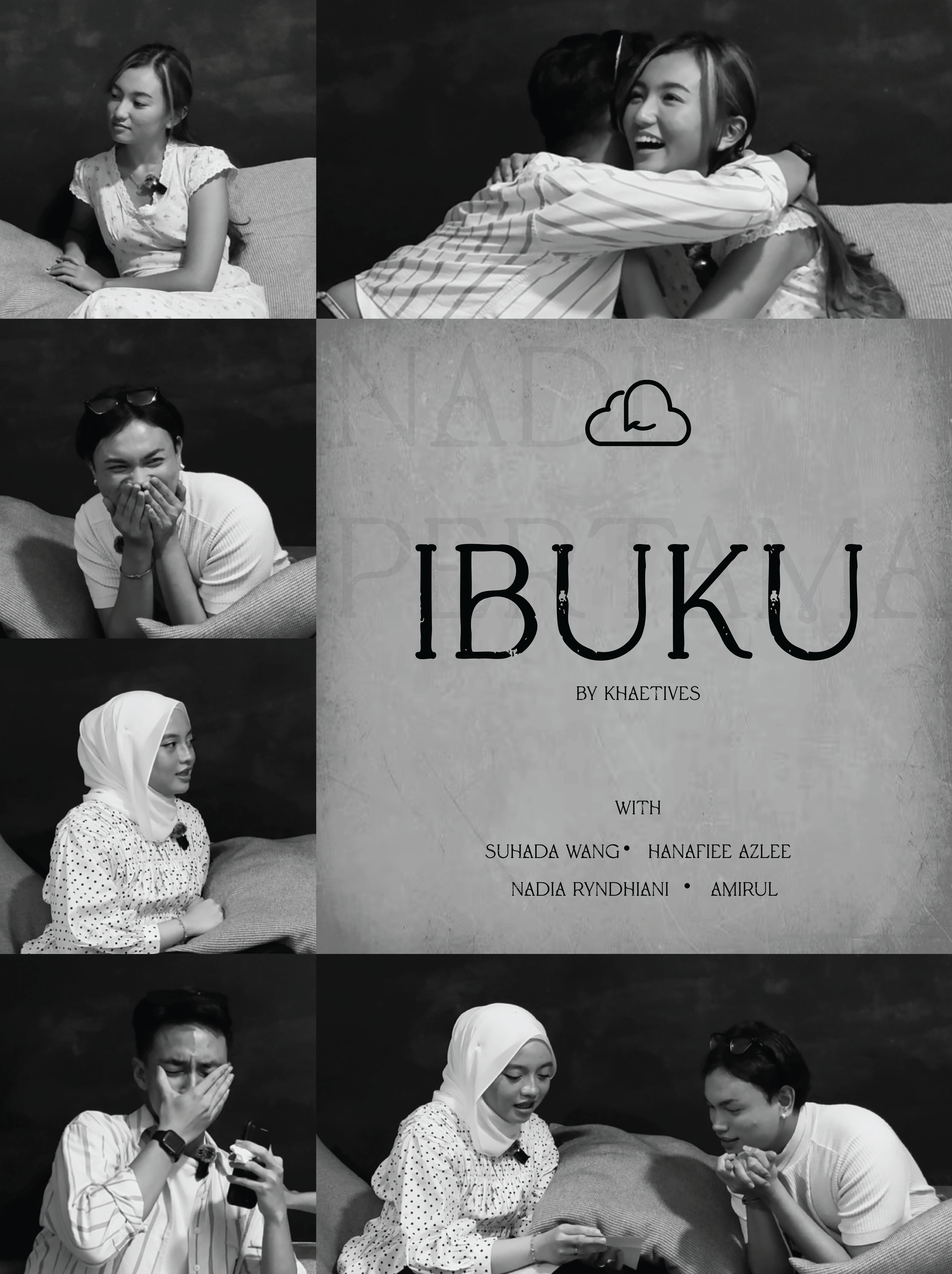
In “Ibuku,” four individuals; Nadia, Hanafiee, Suhada and Amirul, each share heartfelt memories and stories about their mothers — one speaking from the roots of “akar,” another revealing the longing of “lara,” a third offering the quiet warmth of “samar,” and a fourth reflecting the lingering echo of “gema.”
Through their voices and emotions, the video captures the many faces of motherhood: grounding, longing, subtle care, and enduring love.

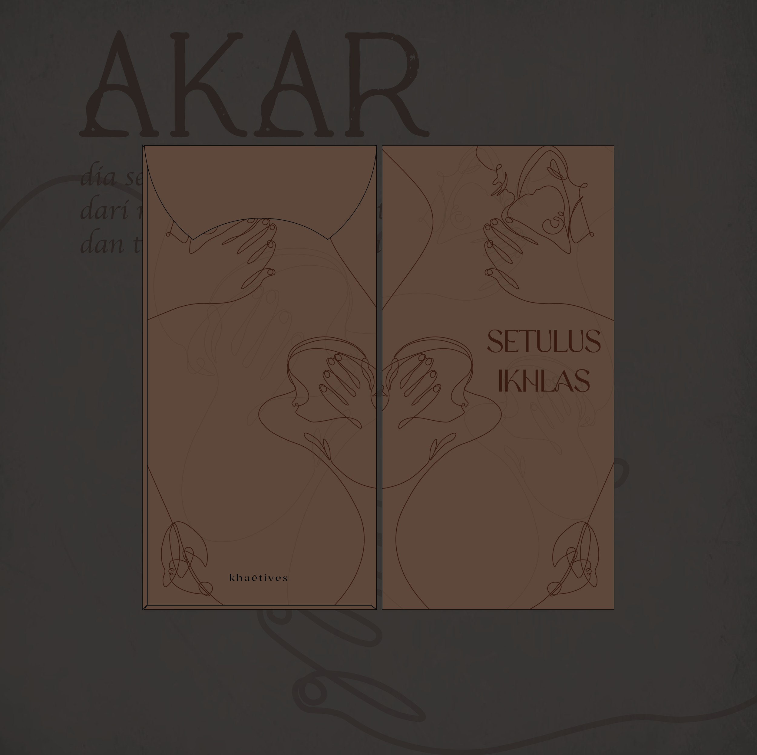
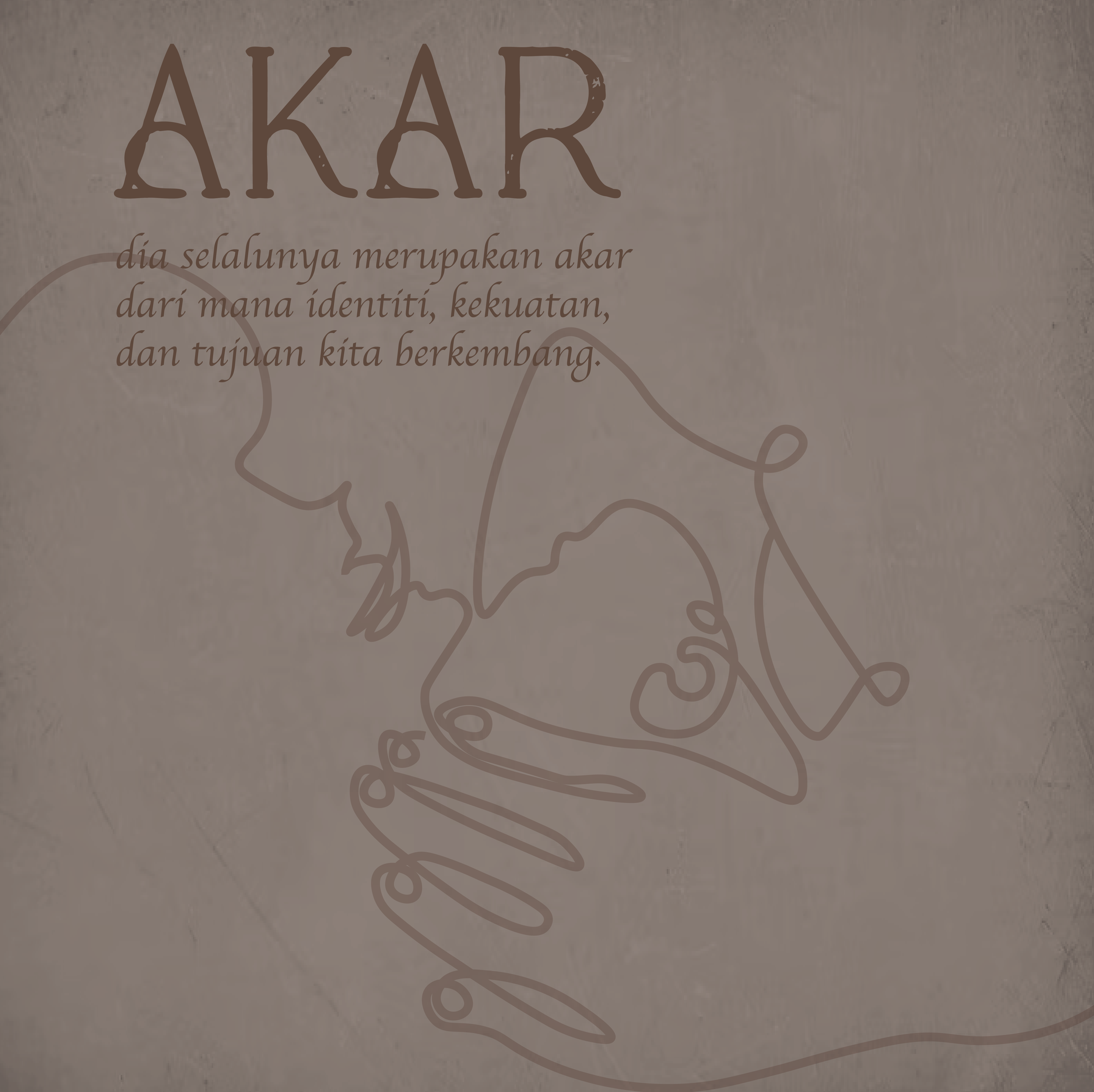
Akar.
“Akar” connects deeply to the theme of “mother,” for she is often the very root from which our identity, strength, and purpose grow. Like roots that anchor a tree, a mother grounds us; offering stability, belonging, and a sense of home no matter where life carries us.
She is the origin of our earliest stories, values, and rhythms, the first pulse we feel that links us to our ancestry and shapes the path ahead. In her presence, we find our foundation; in her lessons, we discover direction. A mother becomes our “akar,” the quiet force beneath the surface that keeps us rooted, steady, and connected to who we truly are.
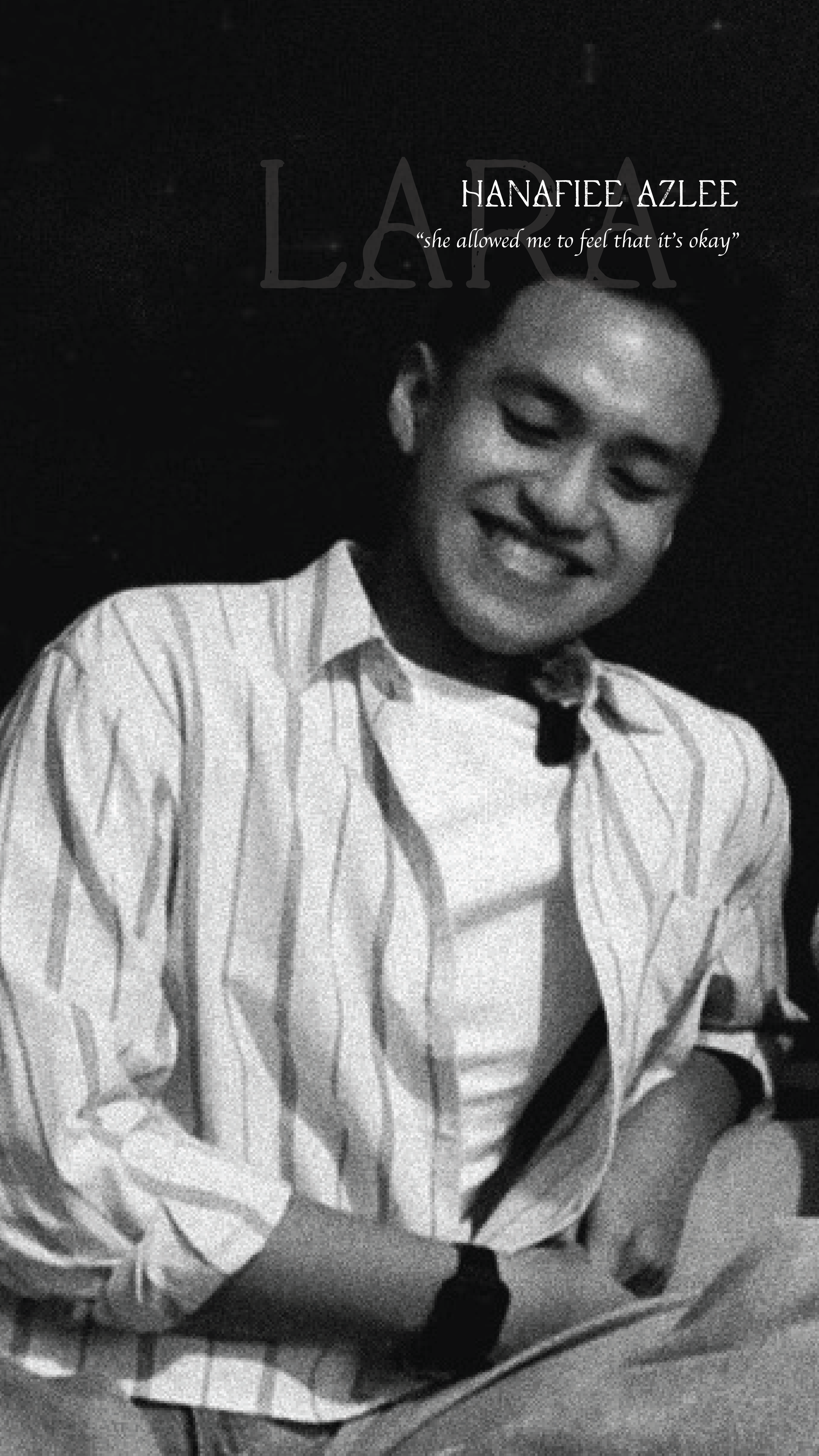
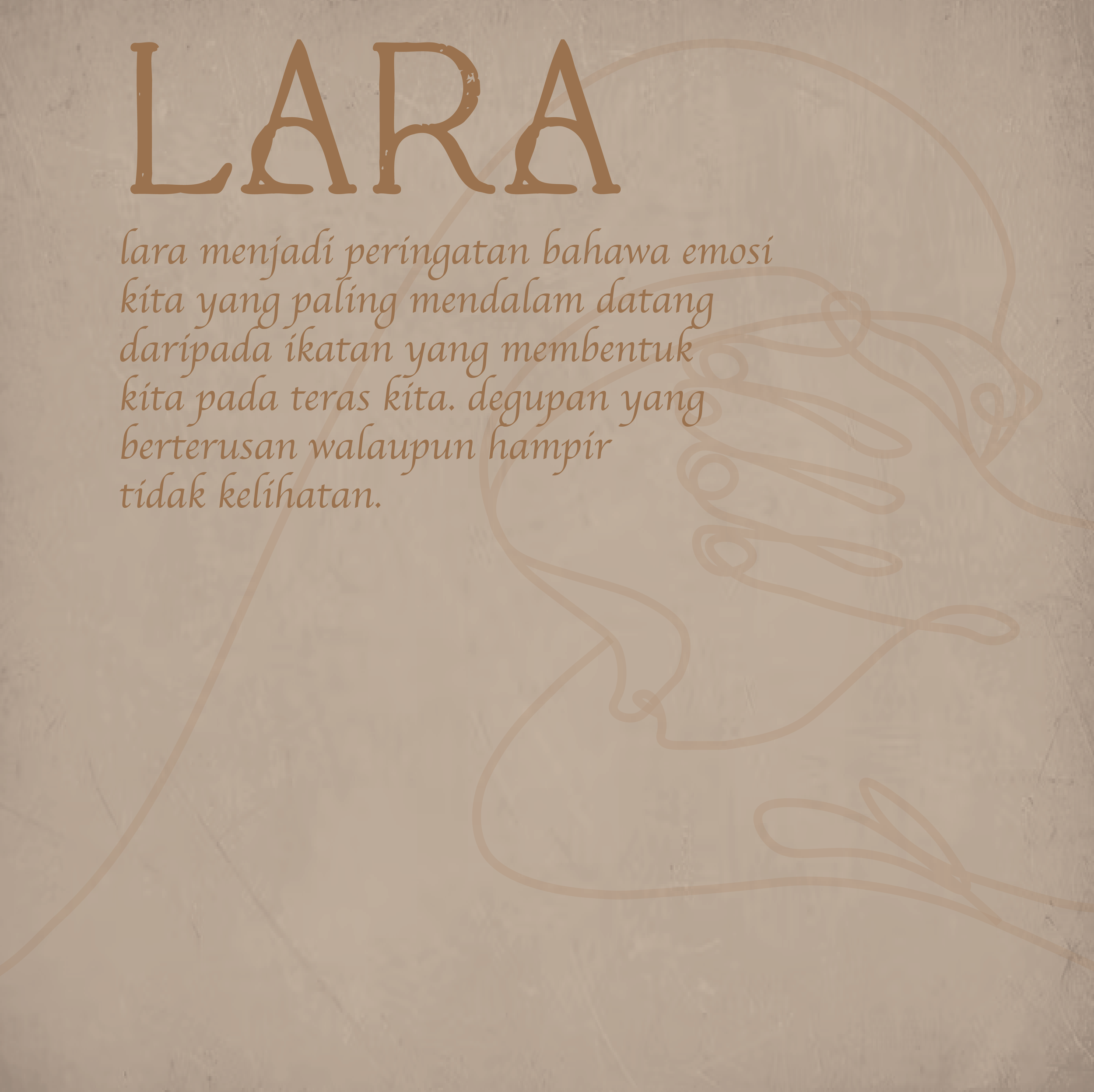
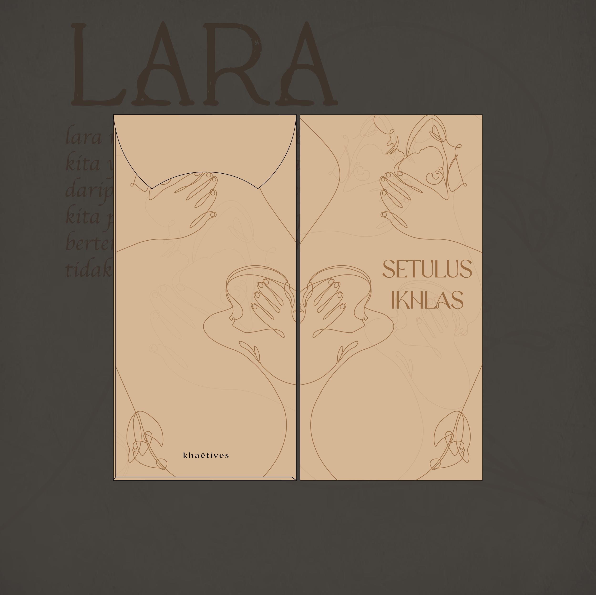
Lara.
“Lara” reflects the quiet longing and emotional depth that so often stems from our connection to a mother. It reflects the quiet ache of missing her warmth, the tenderness of memories that linger, and the love that shapes us long after childhood.
A mother becomes the source of that melancholic passion: the person whose sacrifices, comfort, and gentle rhythms leave an imprint on our hearts.
In life’s journey, lara is the soulful beat that reminds us of the moments she held us together, the lessons she whispered, and the love that continues to guide us. Through her, lara becomes a reminder that our most profound emotions come from the bonds that shape us at our core.
a mother is the first pulse we know - her heartbeat starts our journey. Her love beccomes rhythm that carries us through life, quietly guiding each step with strength and grace.
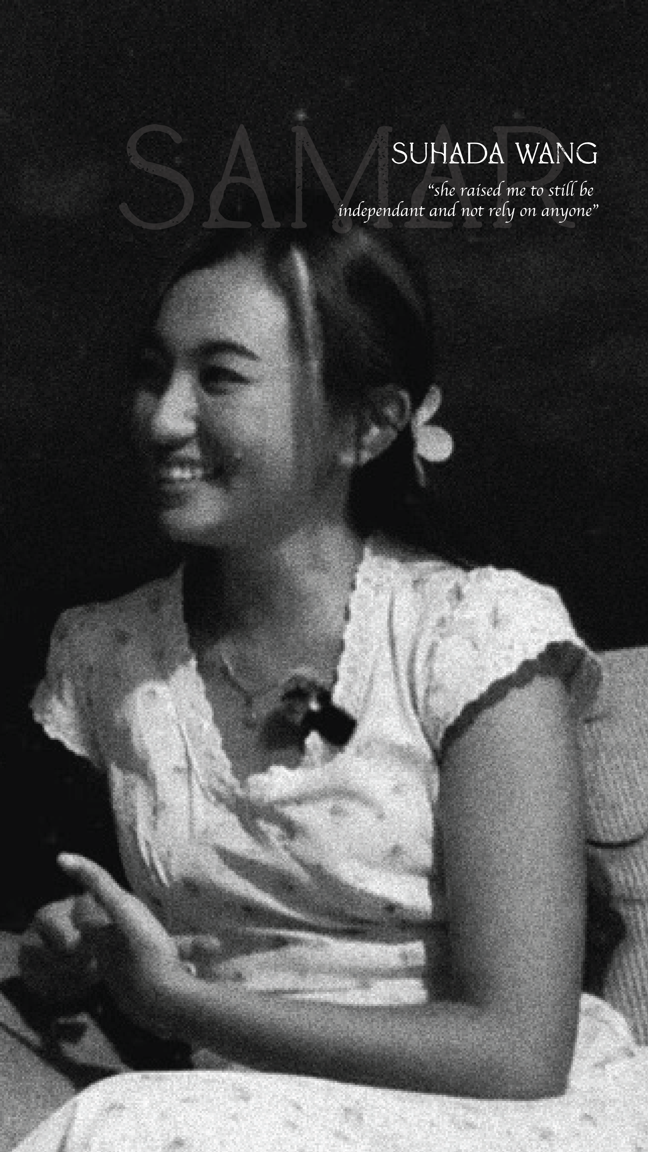
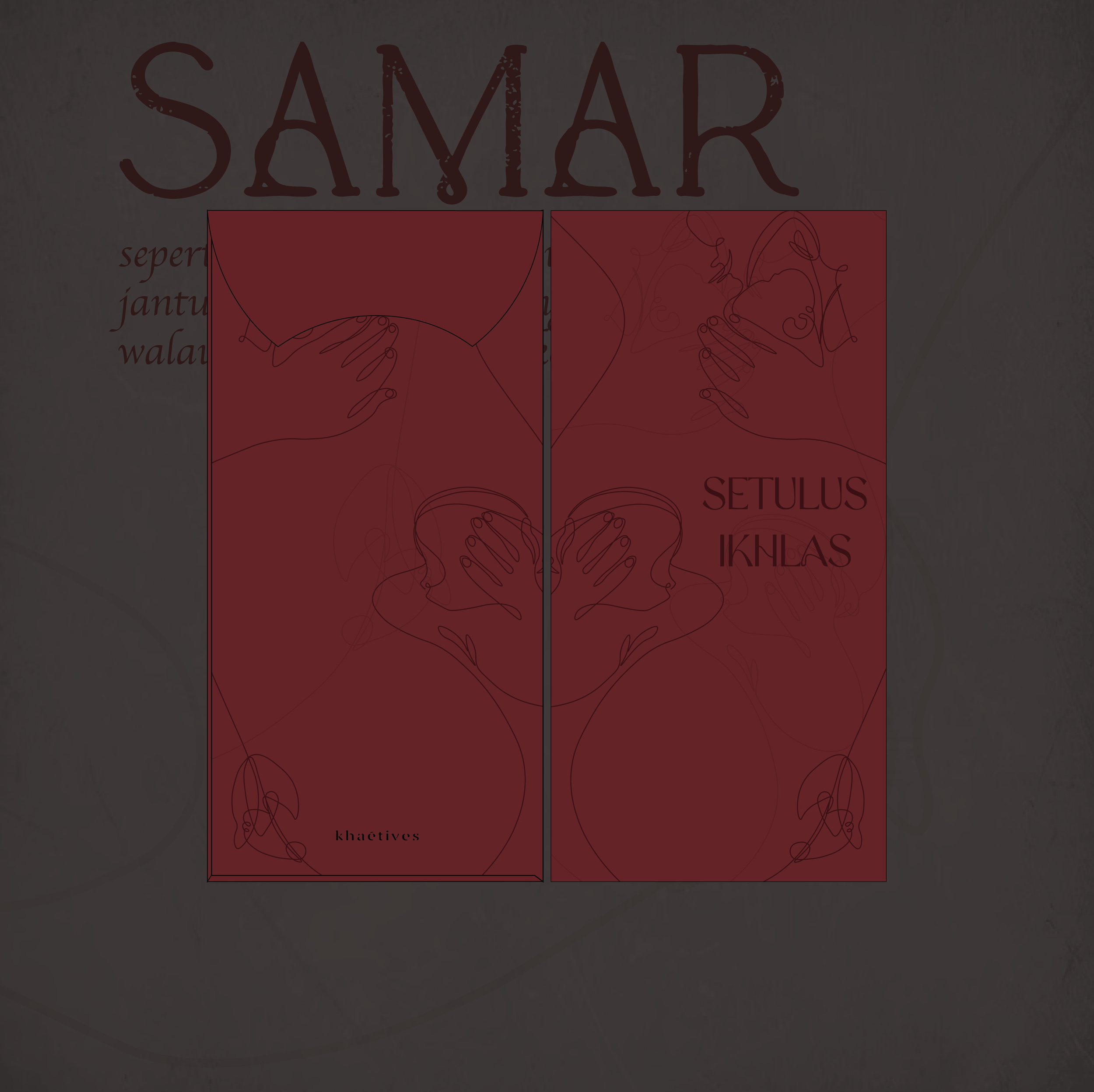
Samar.
“Samar” evokes the idea of something soft, subtle, and barely there; like a faint light or a quiet heartbeat that persists even when almost unseen. It represents the gentle details in life that still hold power, the small signals that tell us life continues even in moments of stillness.
Samar mirrors the quiet ways a mother loves: the unspoken care, the soft reassurances, the little acts that often go unnoticed but shape us deeply. She is the faint light that guides us in darkness, the steady heartbeat we may not always hear but always feel. Through her subtle presence, we learn that even the smallest gestures can carry life, warmth, and meaning; reminding us that love does not need to be loud to be life-giving.
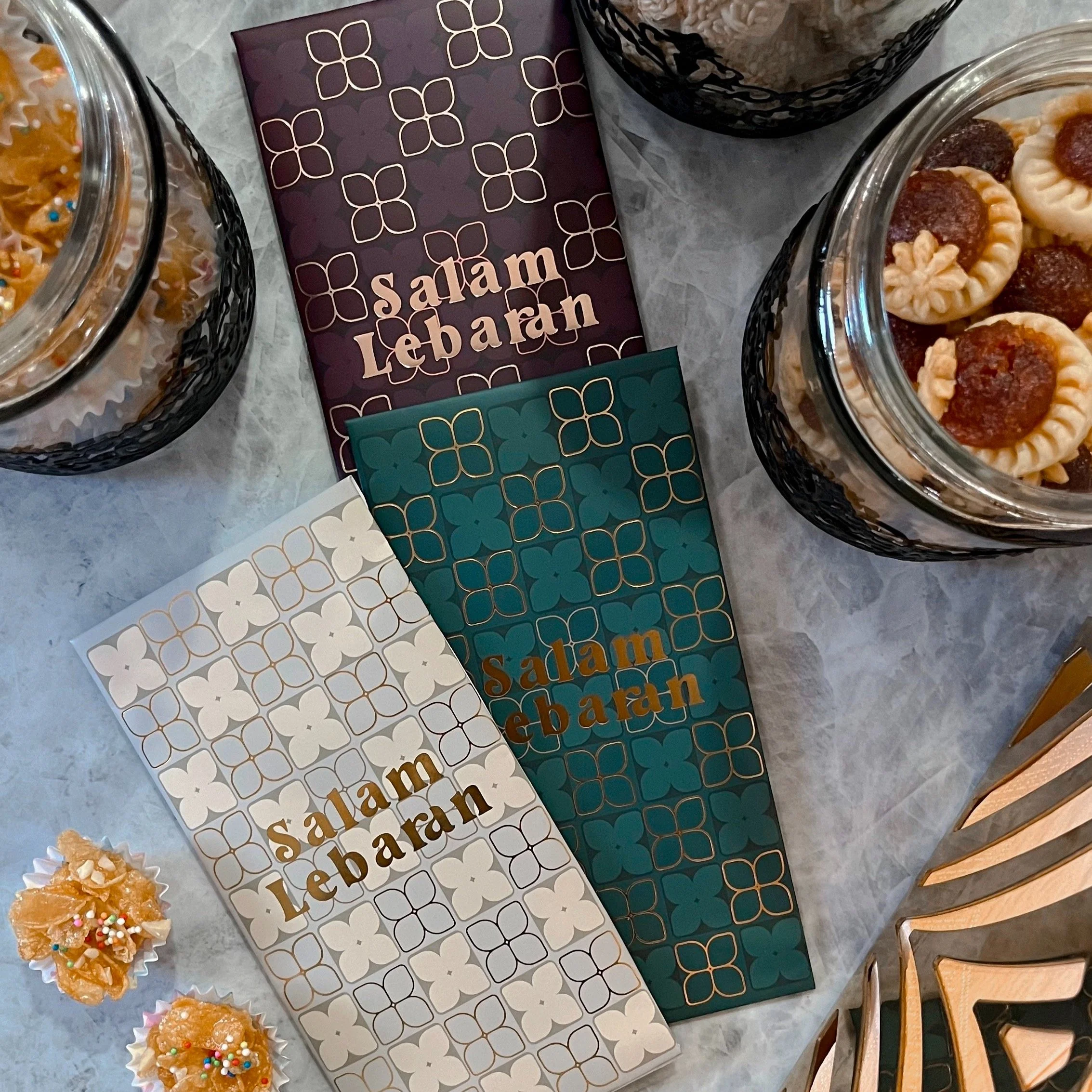
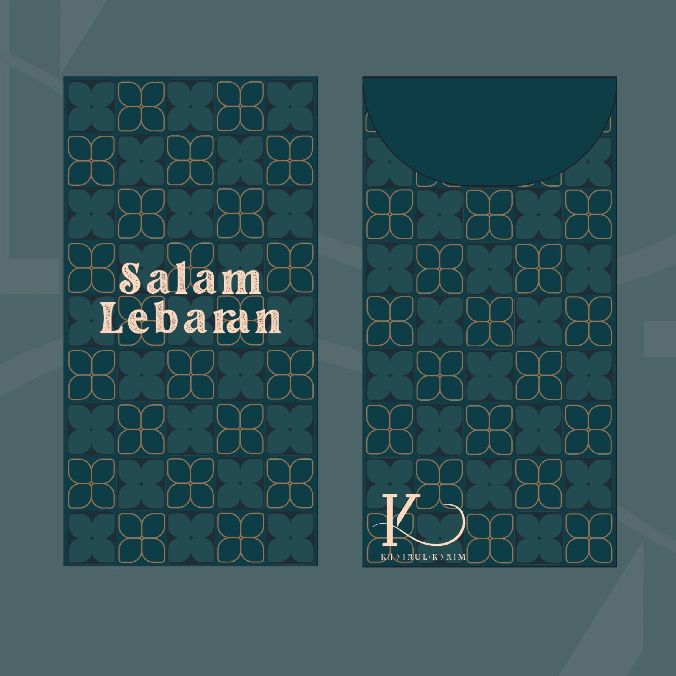
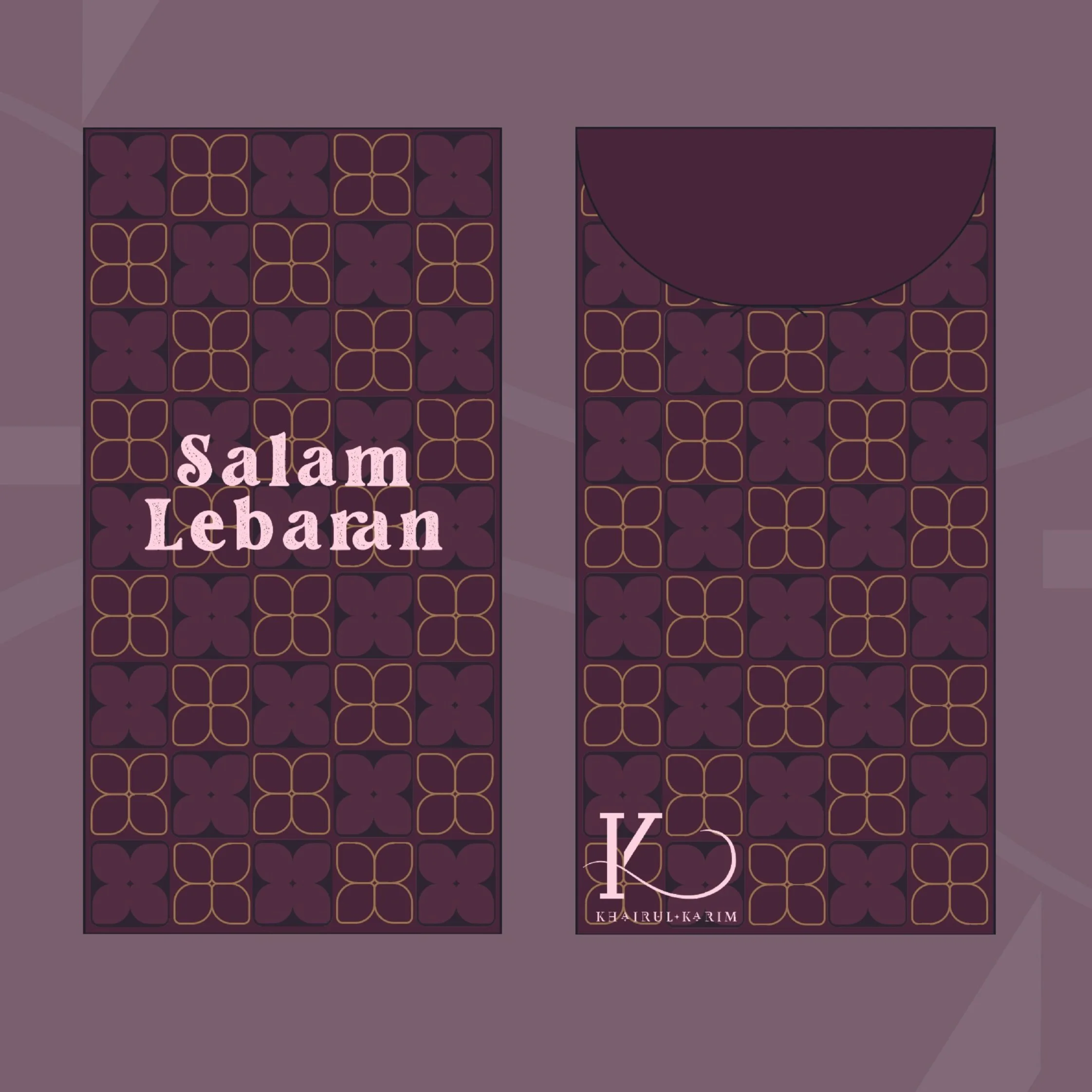
“Ibu: Nadi Pertama” also introduces a brand-new series of green packets for Hari Raya 2026, marking the brand’s return after a two-year hiatus from khaétives’ signature product, the sampuls.
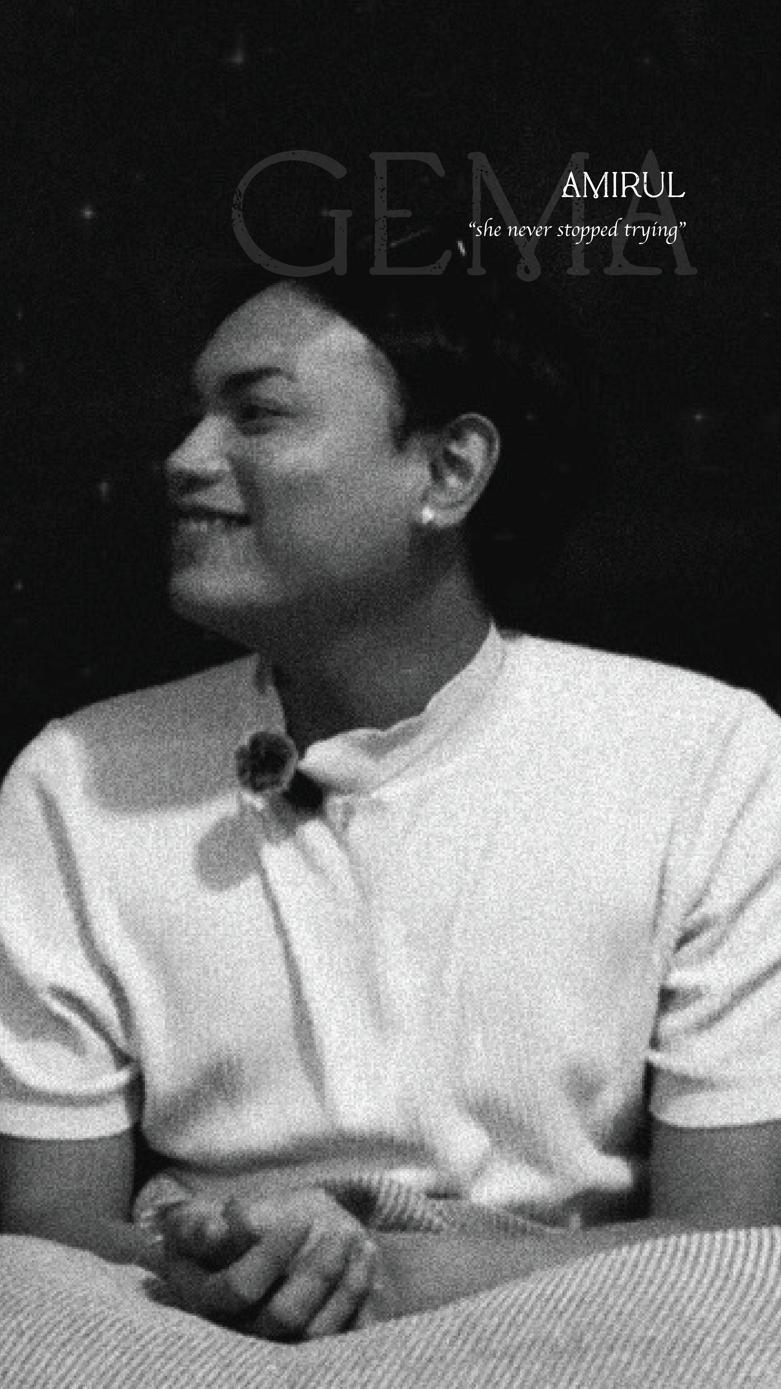
Gema.
“Gema” is the echo that lingers long after the original sound fades; a resonance that repeats softly, shaping the space around it. It symbolizes the impressions and emotions that stay with us, the way certain moments or voices continue to vibrate through our lives. When connected to the theme of “mother,” gema reflects the way her love, words, and presence live on within us.
Even when she is not physically beside us, her lessons resurface in our choices, her comfort echoes in our resilience, and her heartbeat becomes a rhythm carried forward in our own. A mother’s influence is a kind of echo — gentle yet enduring, subtle yet powerful; reminding us that love, once given, continues to resonate through every chapter of our journey.

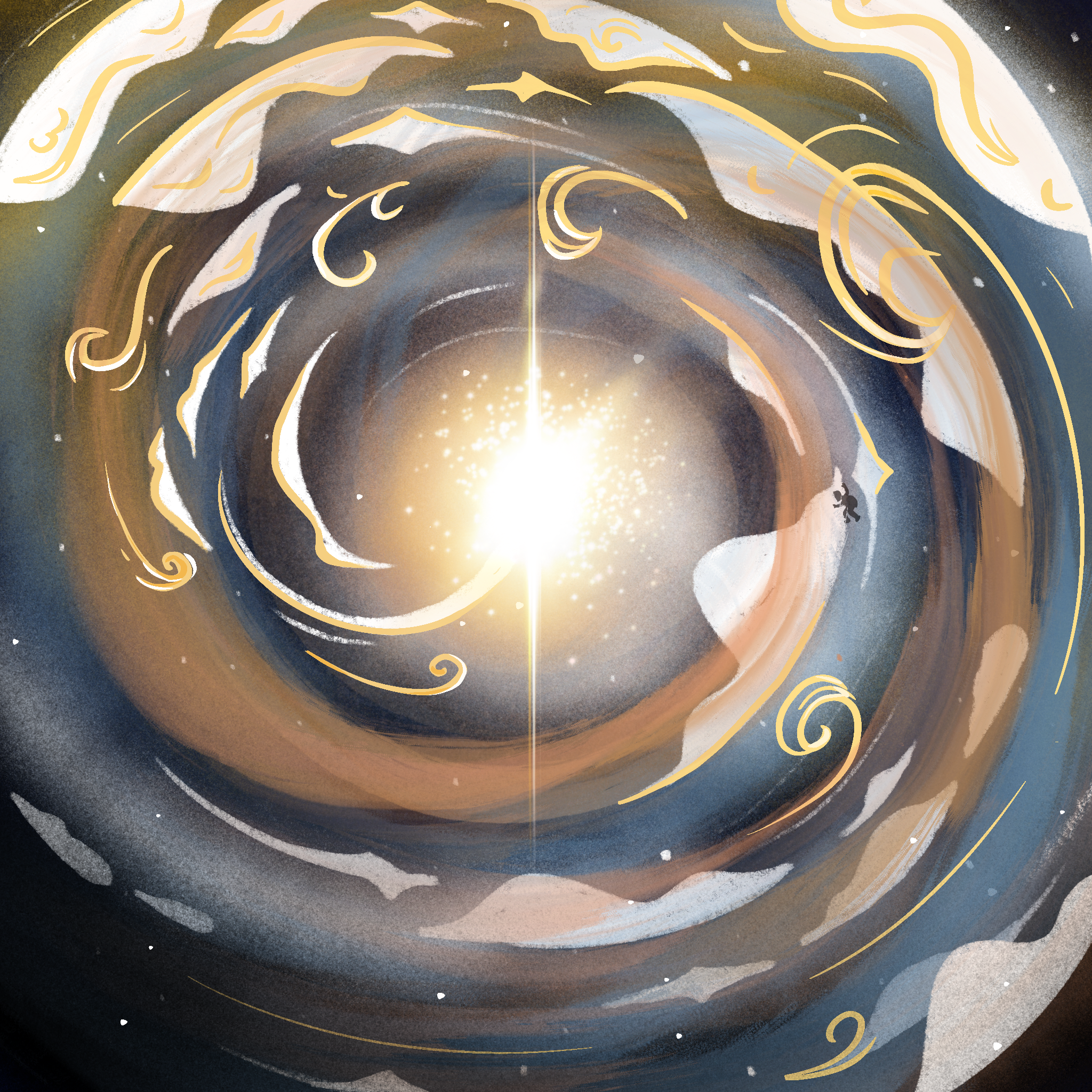
As part of Khaétives’ rebrand, Solstice is about reflecting how Khaétives now fully recognises its own value, growth and identity. -a quiet flex of maturity and knowing it’s impact, even if others don’t see it.
It is followed by 4 different artworks representing the glow, soft, intentional and powerful beginning into a new era, each titled Solstice, Lustre, Gilded and Aurora respectively.
Solstice
Starting off with Solstice, this piece is inspired by the golden hour where it signals a transition - quiet yet immense in significance. It also marks a powerful cosmic shift - either the longest day or the longest night of the year. It’s a turning point, a pause before change, where stillness holds deep meaning, much like the golden hour. It’s when the sun stands still, but everything begins to move in a new direction.
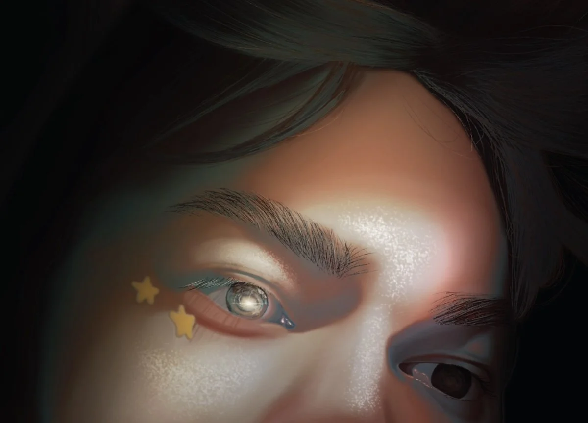
Lustre is shown as not loud but luminous - it lives in the gaze. It’s the quiet glow of inner worth, with Solstice being reflected in the eye, the shimmer of skin, the softness of presence. Not a glare, but a glow; timeless, elegant and deeply felt. A beauty that doesn’t speak loudly, but stays.
The stars beneath the eyes aren’t just decoration, they are symbols of quiet dreams, of wishes held close yet burning brightly. Their placement speaks of innocence, hope, and the beauty of becoming.
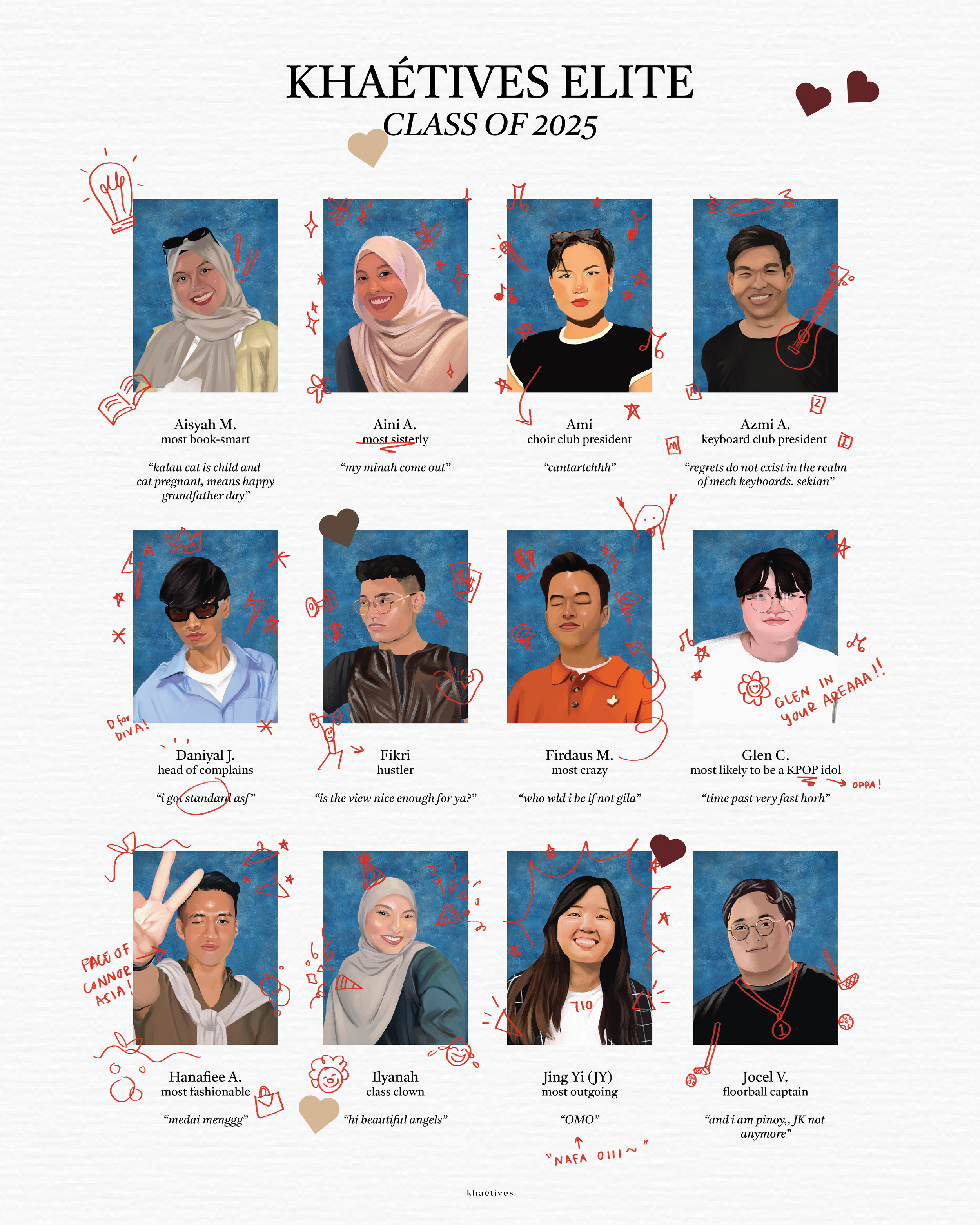
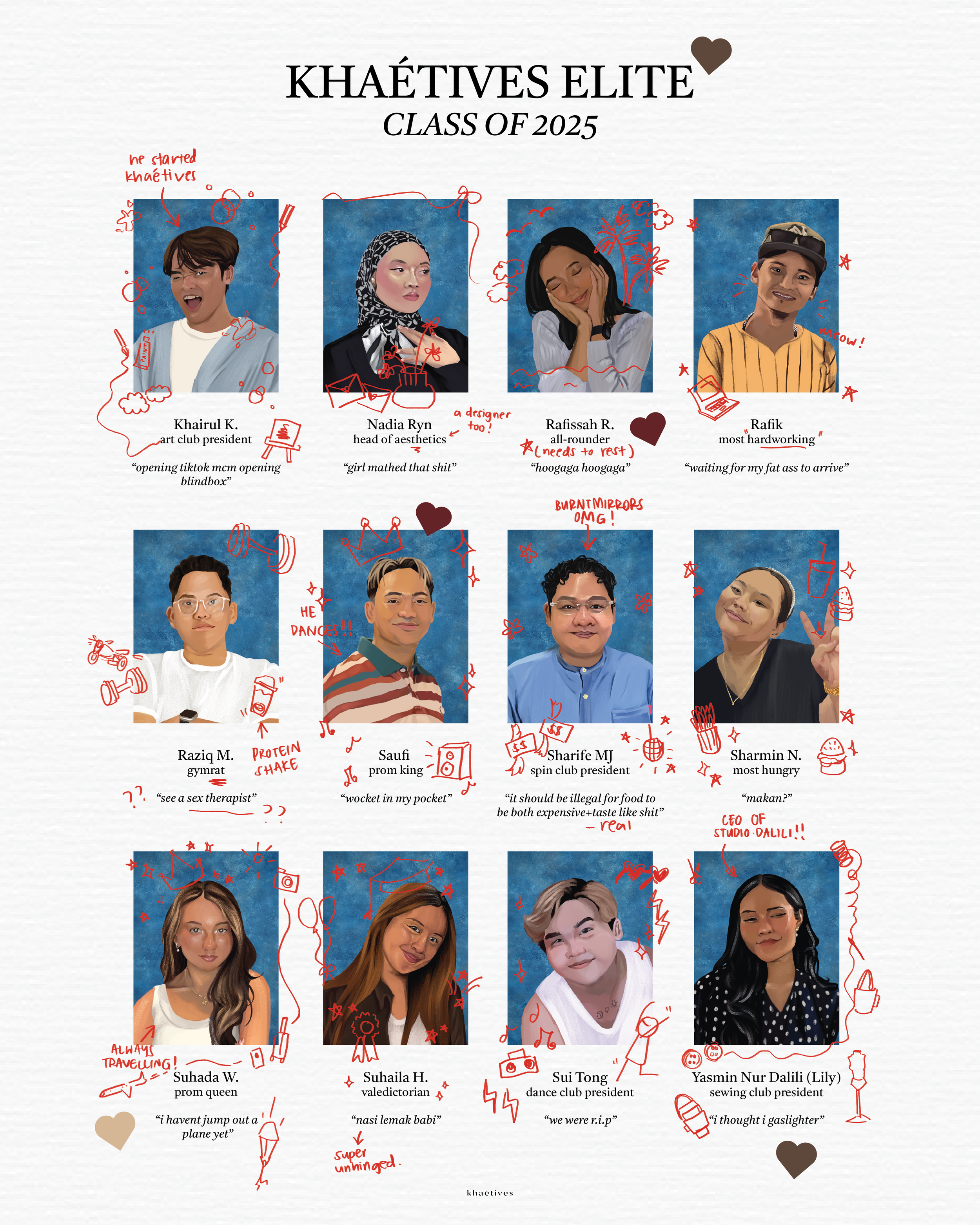
Aurora, the art of radiant transition is reflected in the ‘Yearbook of Friends 2025’ , a fun artpiece where each portrait captures not just who our friends are, but who i remember them by and who they are as a person . The drawings and their different personalities written beneath them become a time capsule of this moment — a record of growth, change, and connection.
Just like an aurora, friendships shift, evolve, and glow differently over time, yet remain part of the same sky. This piece is a celebration of the people who walked with us through this chapter, carrying memories from the past into the light of what’s to come.
Gilded symbolises something refined, golden, and elevated; not in extravagance, but in value. To gild something is to honour it, to recognise its worth, and preserve it with care. Transforming something meaningful into something timeless.
In the context of ‘Ibu: Nadi Pertama’ or ‘Mother: The First Pulse’, Gilded becomes a tribute to mothers. The first heartbeat, the first home, the first love we ever know. Their quiet strength, sacrifices, and unwavering presence are so deeply woven into us that we often forget how precious they truly are. This project is our way of gilding those memories; turning love, gratitude, and beginnings into something tangible, something remembered, something golden.
As the final piece in the ‘Solstice’ series, Gilded carries a sense of closure and culmination. It reflects a full circle — a return to our origins, to the one who started it all. Ending the series here is intentional: not with something fleeting, but with something foundational, enduring, and eternal.
Because some people are not just part of our story; they are where it begins.
Gilded is not about luxury. It is about honour, reverence, and timeless love.
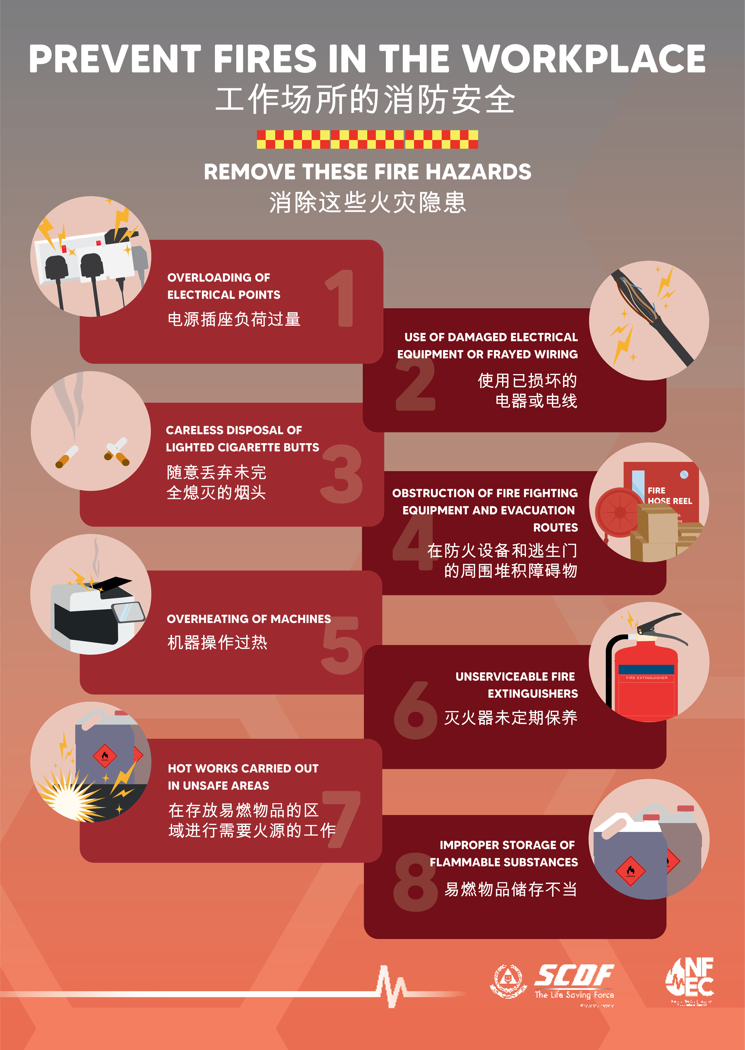
Singapore Civil Defence Force (SCDF)
As a graphic designer at SCDF, I had the opportunity to apply my skills in creating illustrations and designing multiple materials for
public outreach and various events.


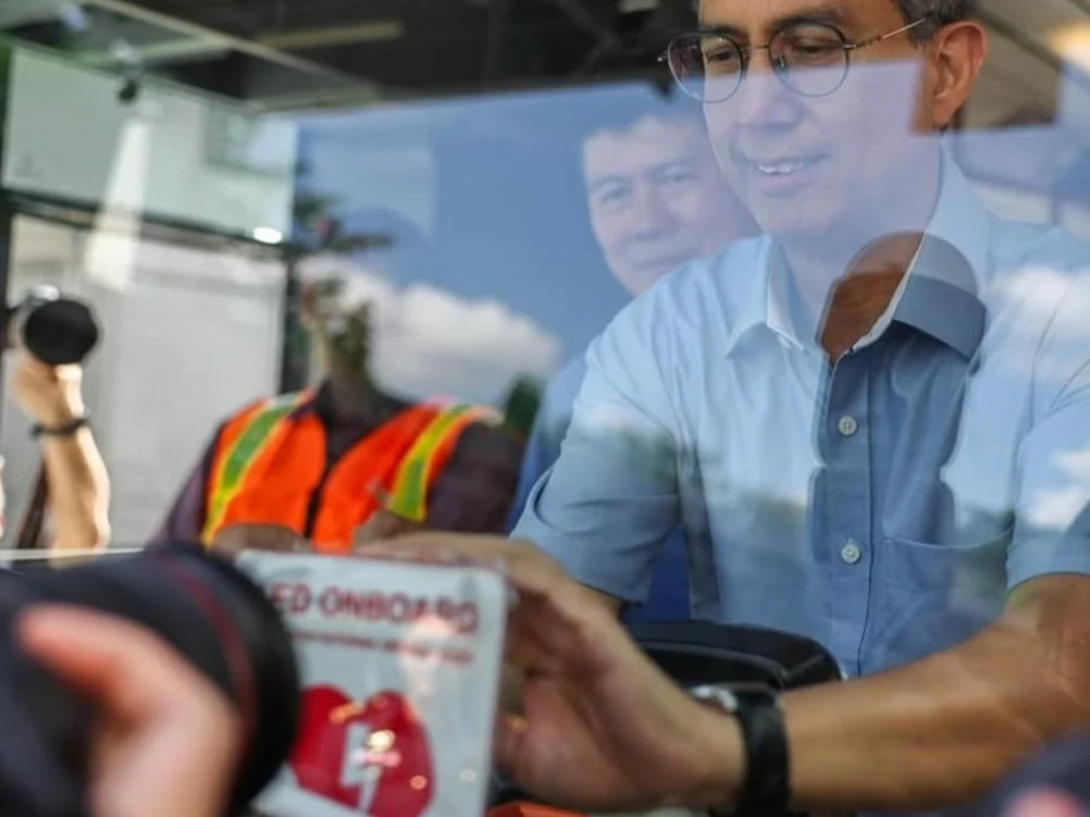
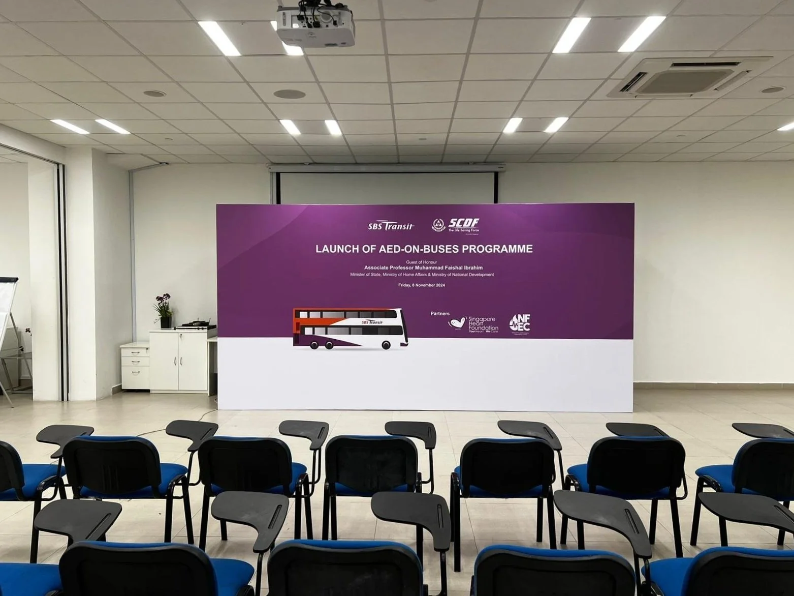
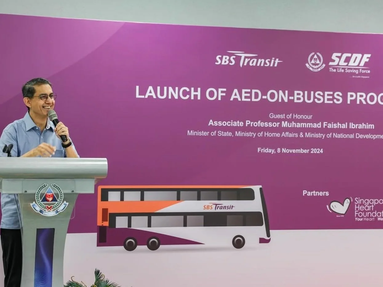
Decals and backdrop for the 2024 launch of the SBST AED-on-Buses Programme


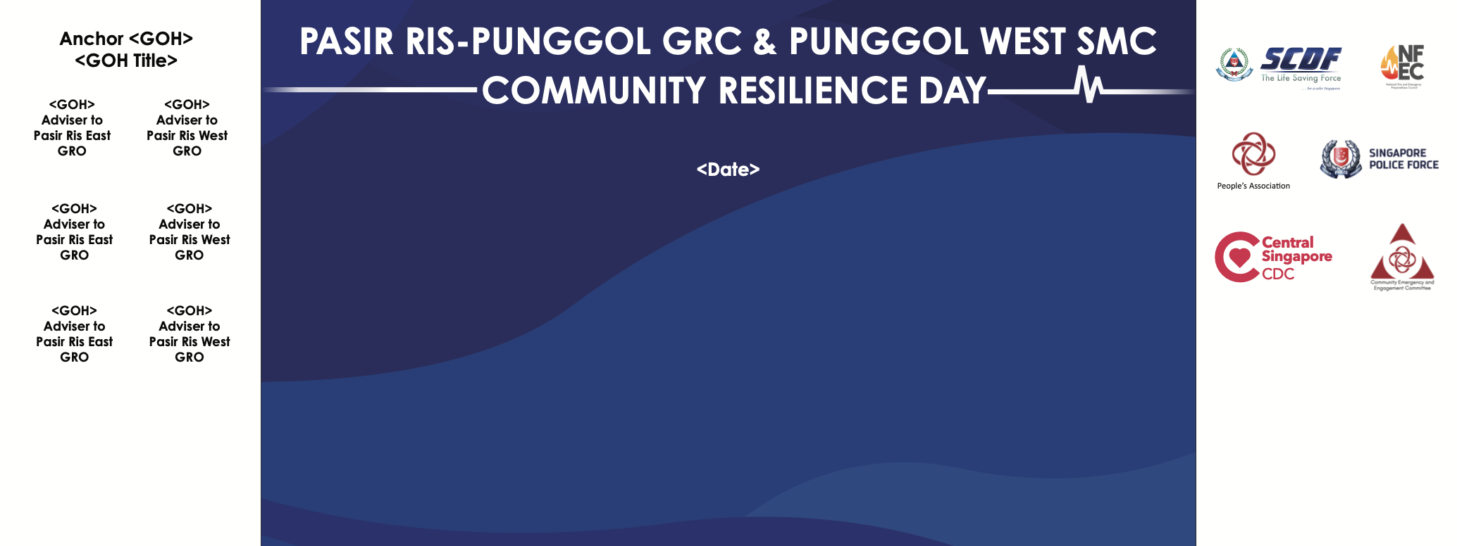
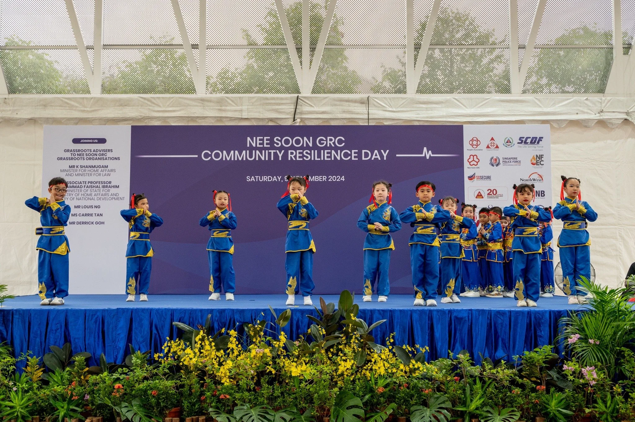
Backdrop for Community Resilience (CR) Day, an event held by the SCDF’s four land Divisions, in partnership with People’s Association and Community Emergency and Engagement (C2E) Committees, to impart and equip Emergency Preparedness (EP) skills to members of the public.
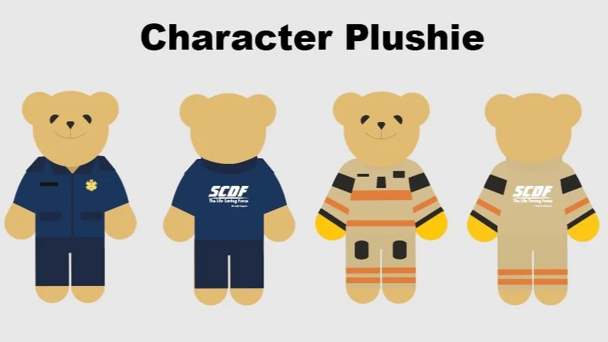
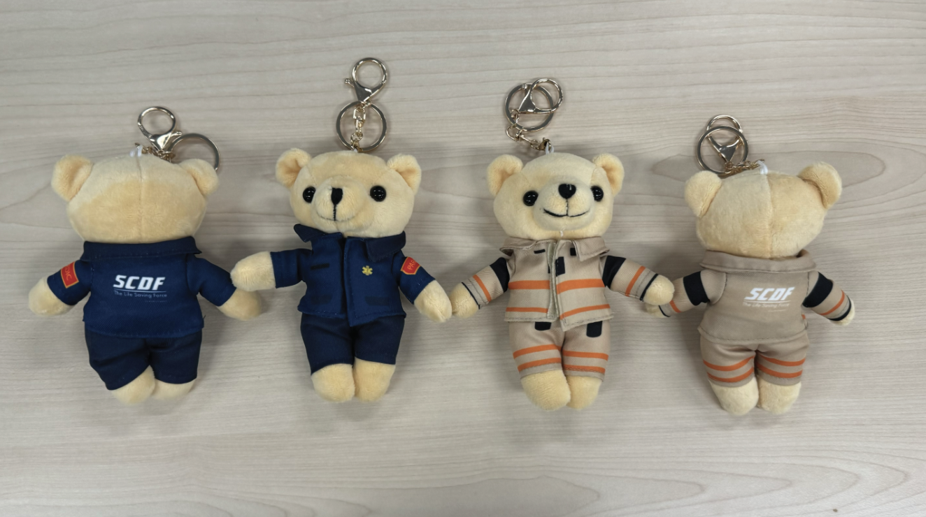
Plushies collateral for the annual Junior Civil Defence Lionhearter (JCDLH) Appointment Ceremony
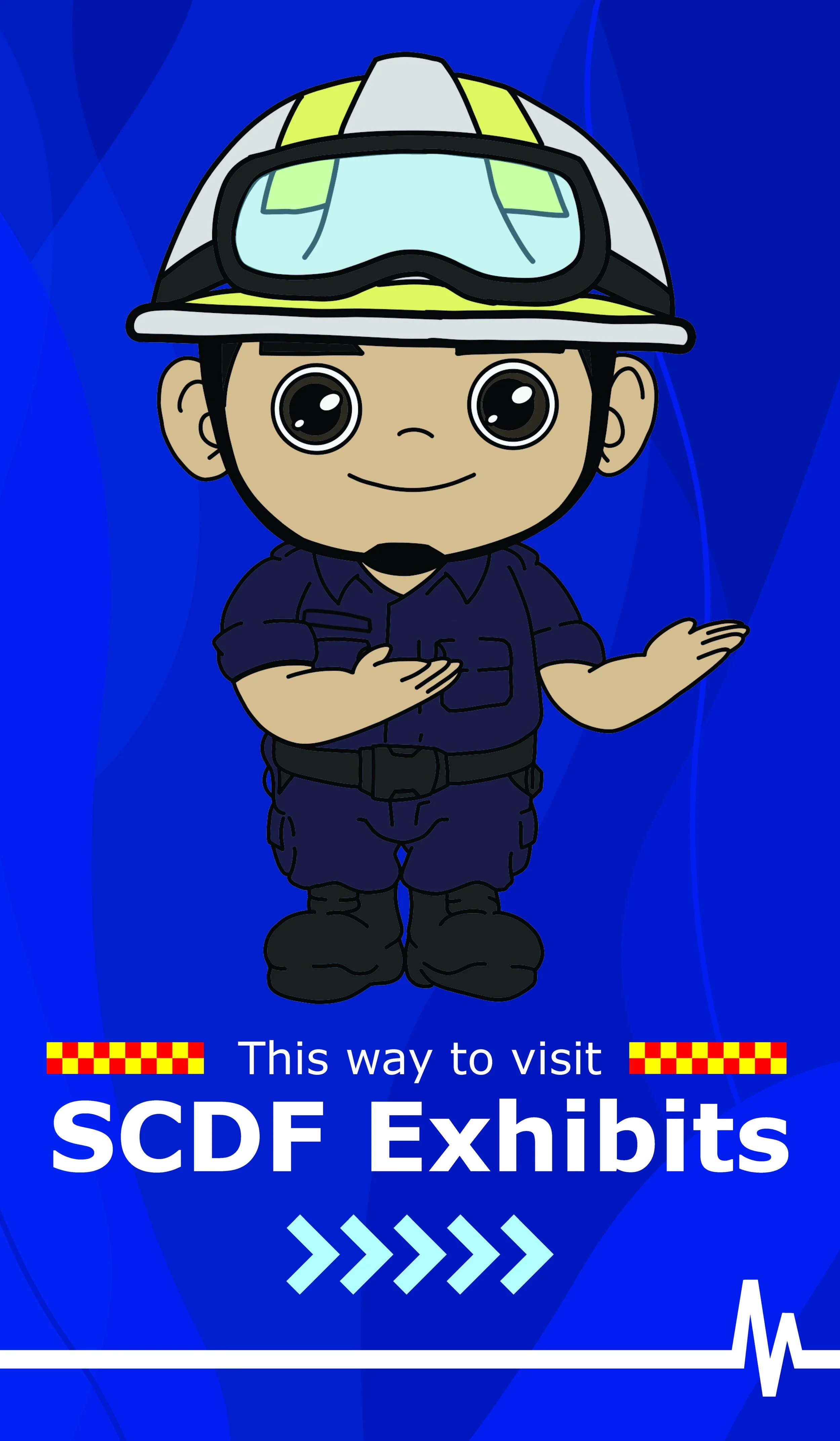
This character was created as signages to guide the public during the Shelter Open House at Gardens by the Bay MRT Station.


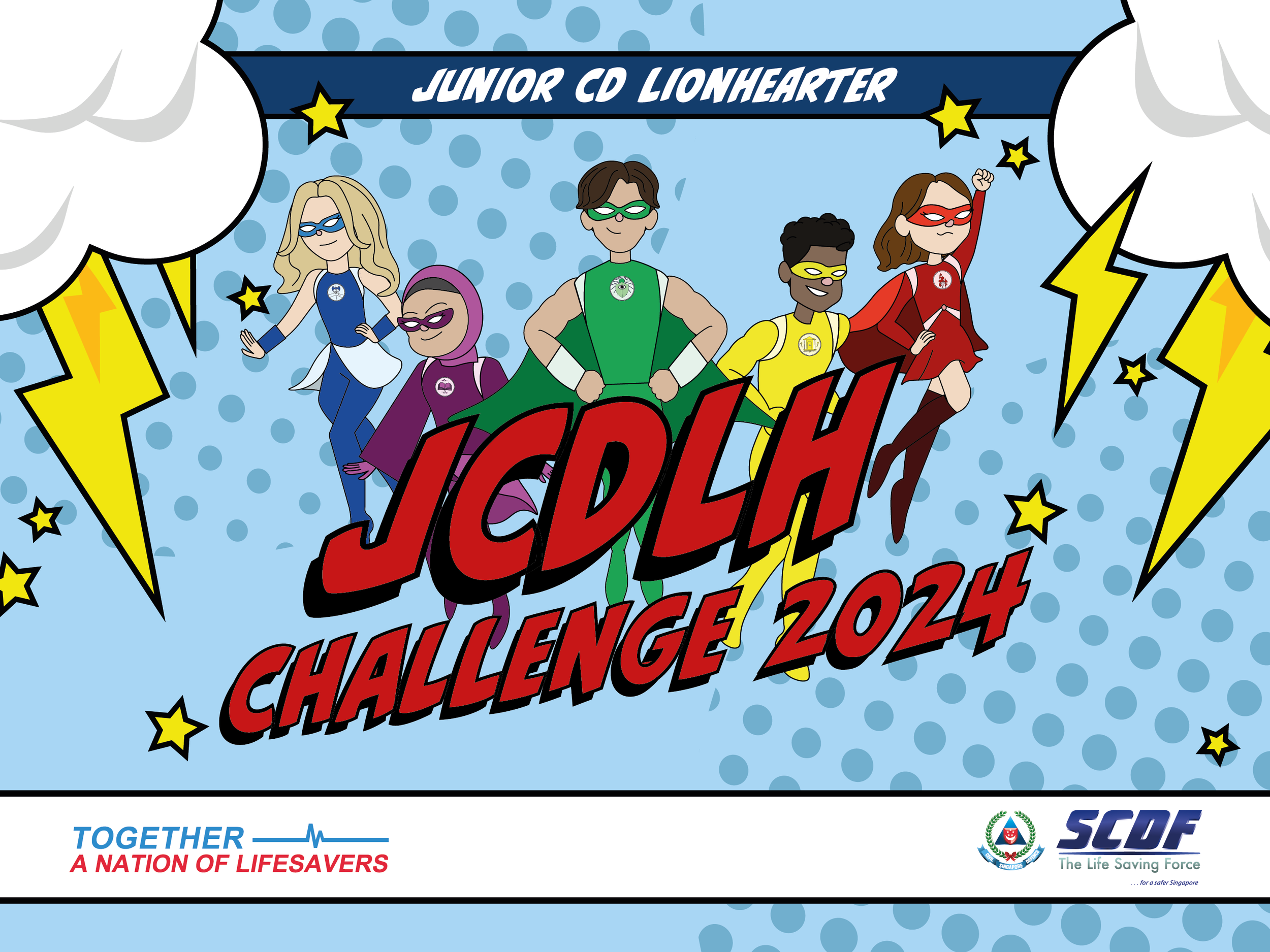
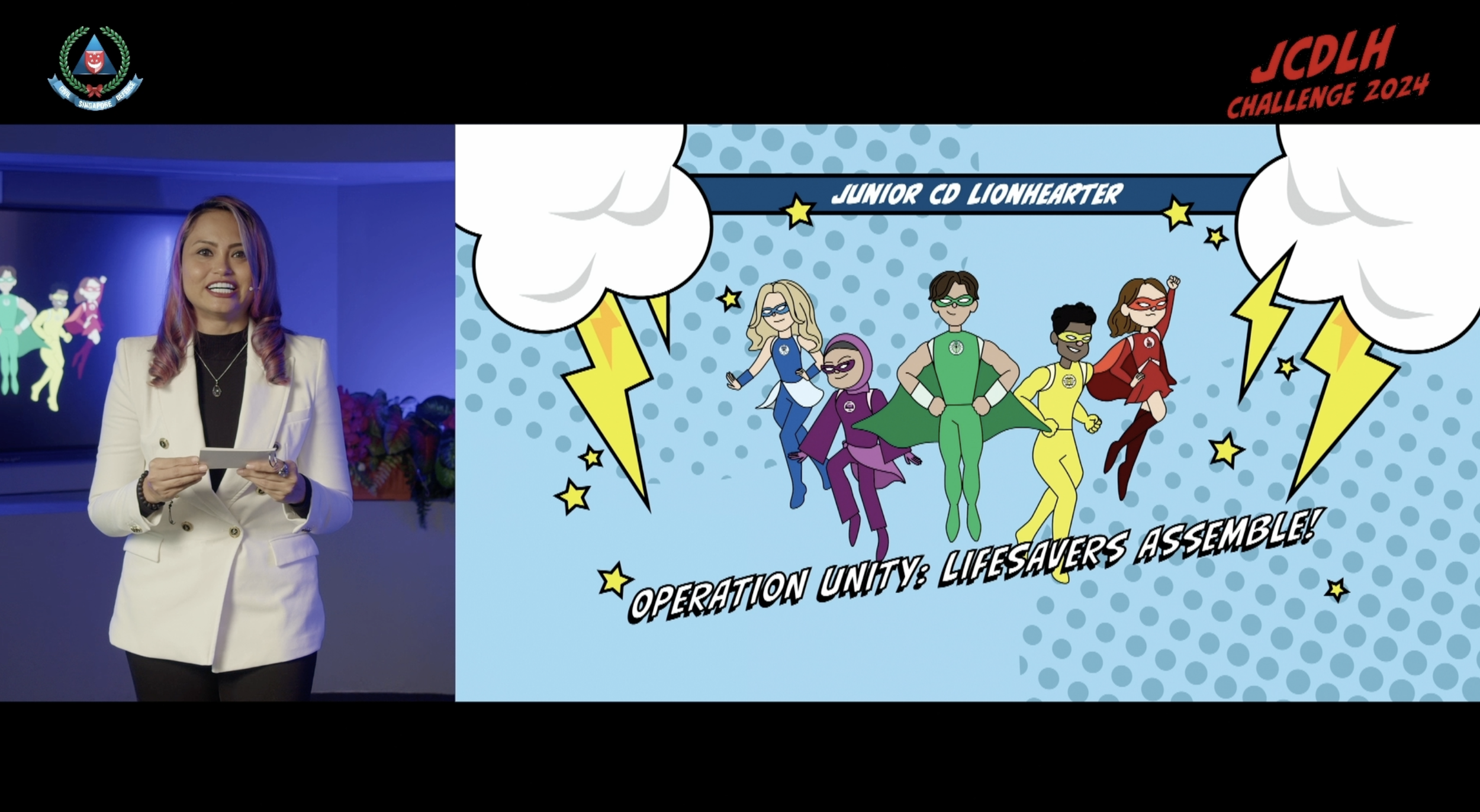
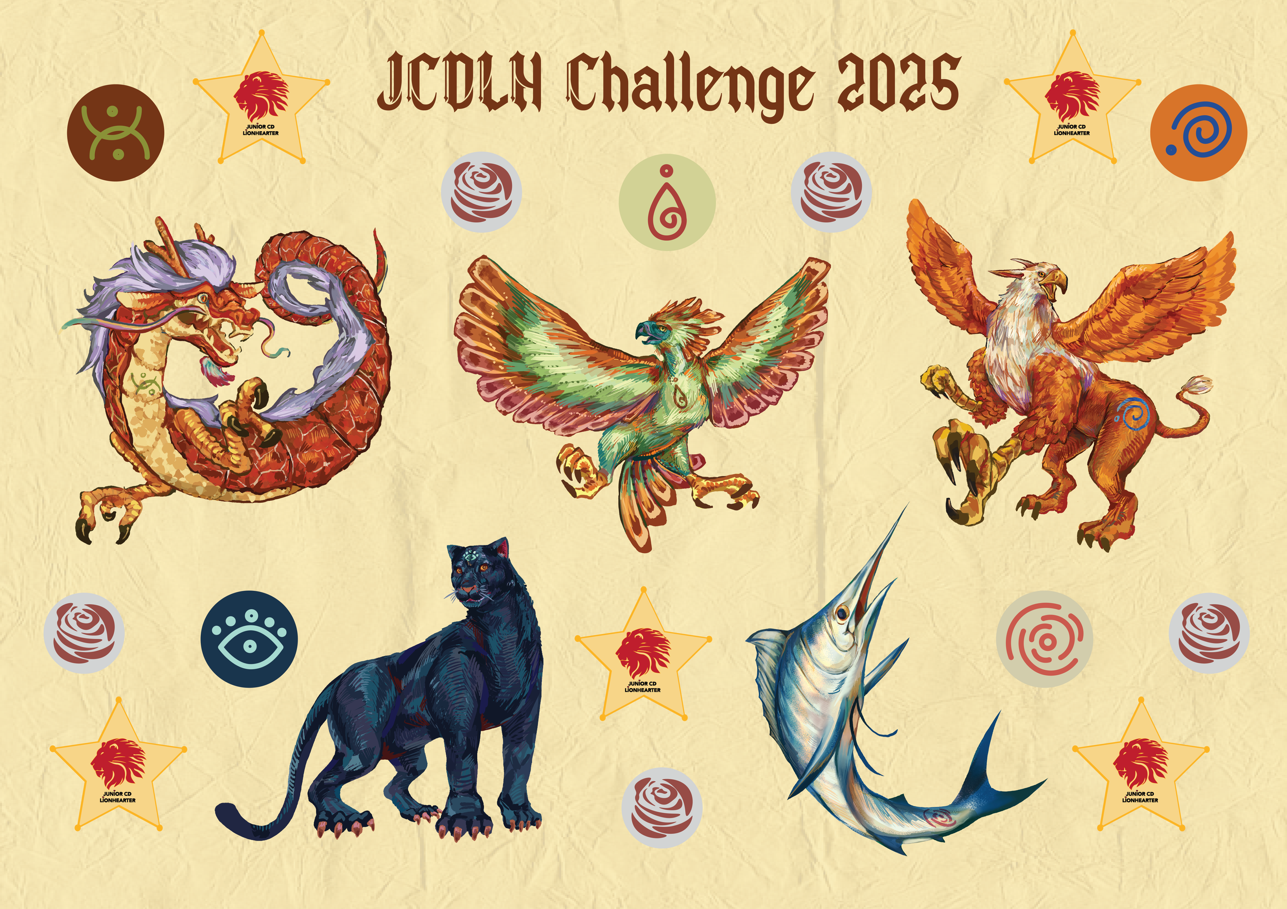
Key visual elements for SCDF's Annual Event, the Junior Civil Defence Lionhearter Challenge, which is aimed at primary school students in Singapore. I contributed by conceptualizing the theme, designing the characters, and various other assets to help bring the challenge to life and engage young participants in an exciting and educational way.
In 2024, the chosen theme was ‘Comic Superheroes’, which I brought to life through my design direction.


The theme for 2025 was ‘Fantasy’, a concept I developed and designed from the ground up.


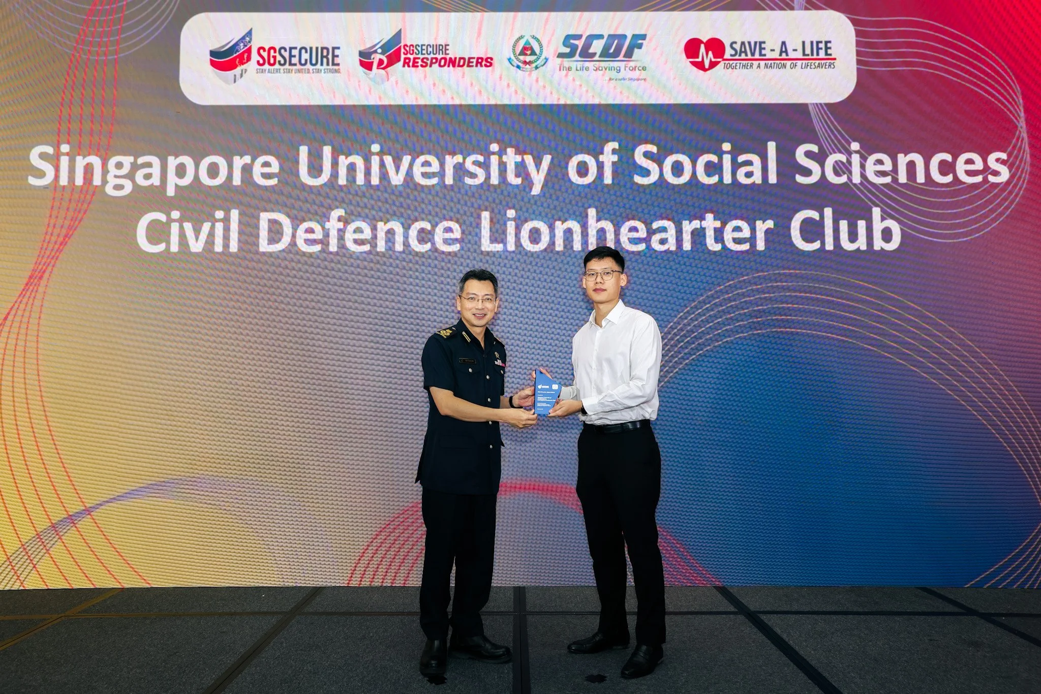
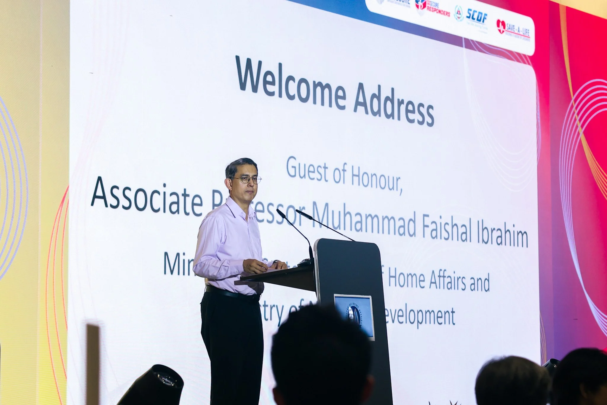
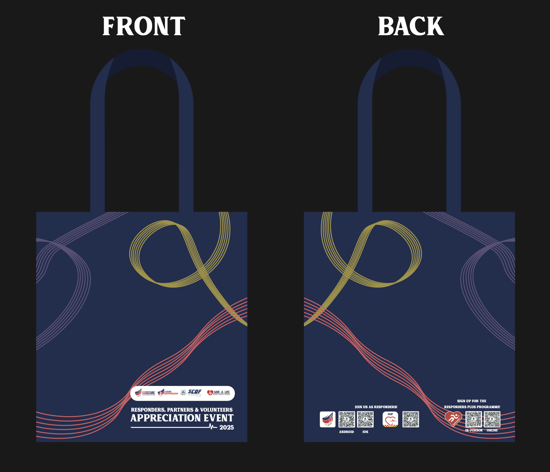
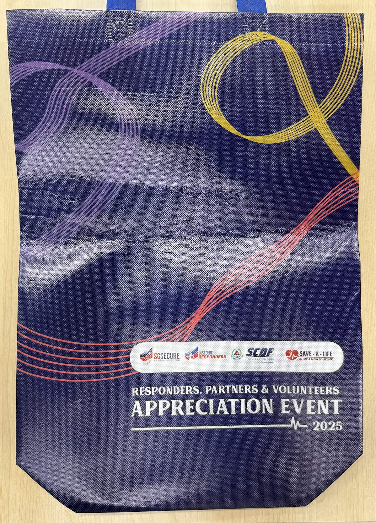
Designs for backdrops and collaterals for a signature annual event - The Responders, Partners and Volunteers Appreciation Event (RPVA)


Medicine: of Letting Go
Medicine: of Letting Go is a reflection on the people who stood by me during my healing journey and darkest moments. This project is seperated into three parts; The Art of Letting Go(1): Acceptance,The Art of Letting Go(2): Restorative, and Medicine: of Letting Go.
The project focuses on ten flowers, each symbolizing a different element that supported my healing journey from a difficult past and painful memories.
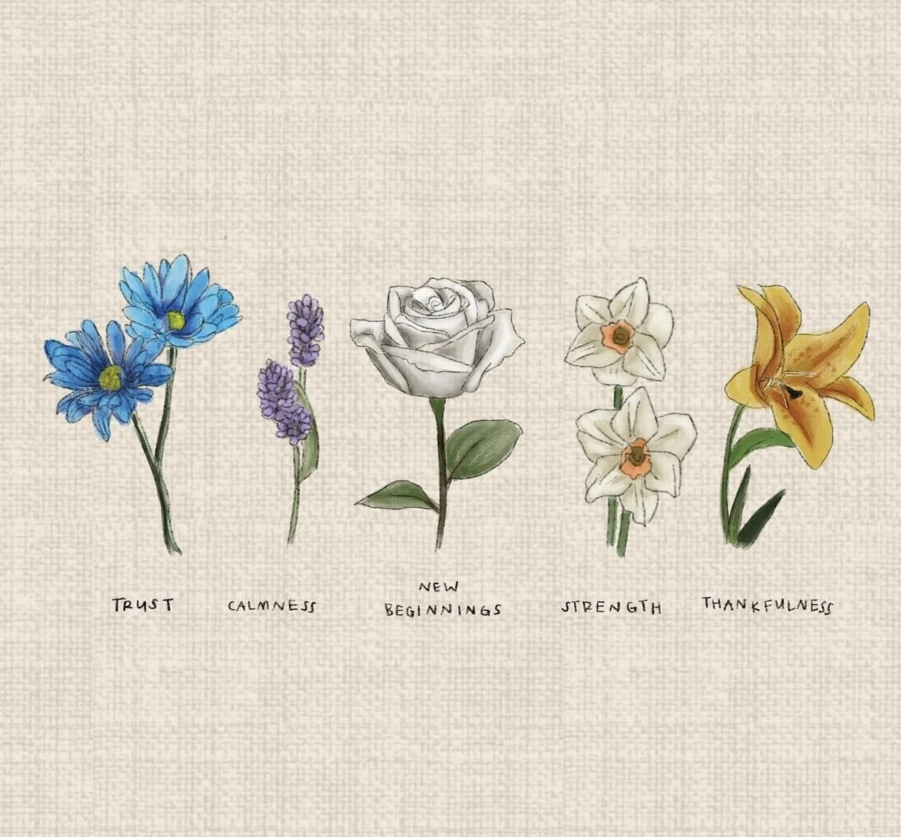
The first part, The Art of Letting Go(1): Acceptance, embodies themes of Trust, Calmness, New Beginnings, Strength, and Thankfulness. It represents the personal transformation that comes with growth—learning to stay calm, trust yourself despite past mistakes, finding the strength to move forward, and feeling thankful for those who supported you as you begin a fresh start.

The Art of Letting Go(2): Restorative. continues the journey from starting anew, focusing on embracing self-love. It’s about freeing yourself from guilt, choosing to let go of the past for the sake of your own happiness, and holding onto hope for the peace you truly need and deserve. This chapter introduces a new set of flowers representing Understanding, Purity, Forgetting the Past, Happiness, and Hope.
The final chapter, Medicine: of Letting Go, does a subtle reveal that the flowers are representations of the specific people who helped me in my chapterof healing.The term “Medicine” is used instead of just “Flowers” to describe these individuals because to me, they were the ones who helped ease the pain, brought comfort, and made things feel lighter.
The flowers from the first two chapters return here, representing those meaningful connections and reinforcing their role in the journey. Alongside them is a visual metaphor of myself: a vase with visible cracks, symbolizing the pain and memories of the past.
Accompanying this chapter is a video of a bestfriend of mine speaking over a call, sharing a heartfelt and in-depth reflection on what it means to recognize these “medicines” in our lives. Her voice plays over a montage of joyful, intimate memories—captured moments from the timeline between when the painful memories began and when it finally started to fade, followed by two drawings of the chapter’s breakdown.
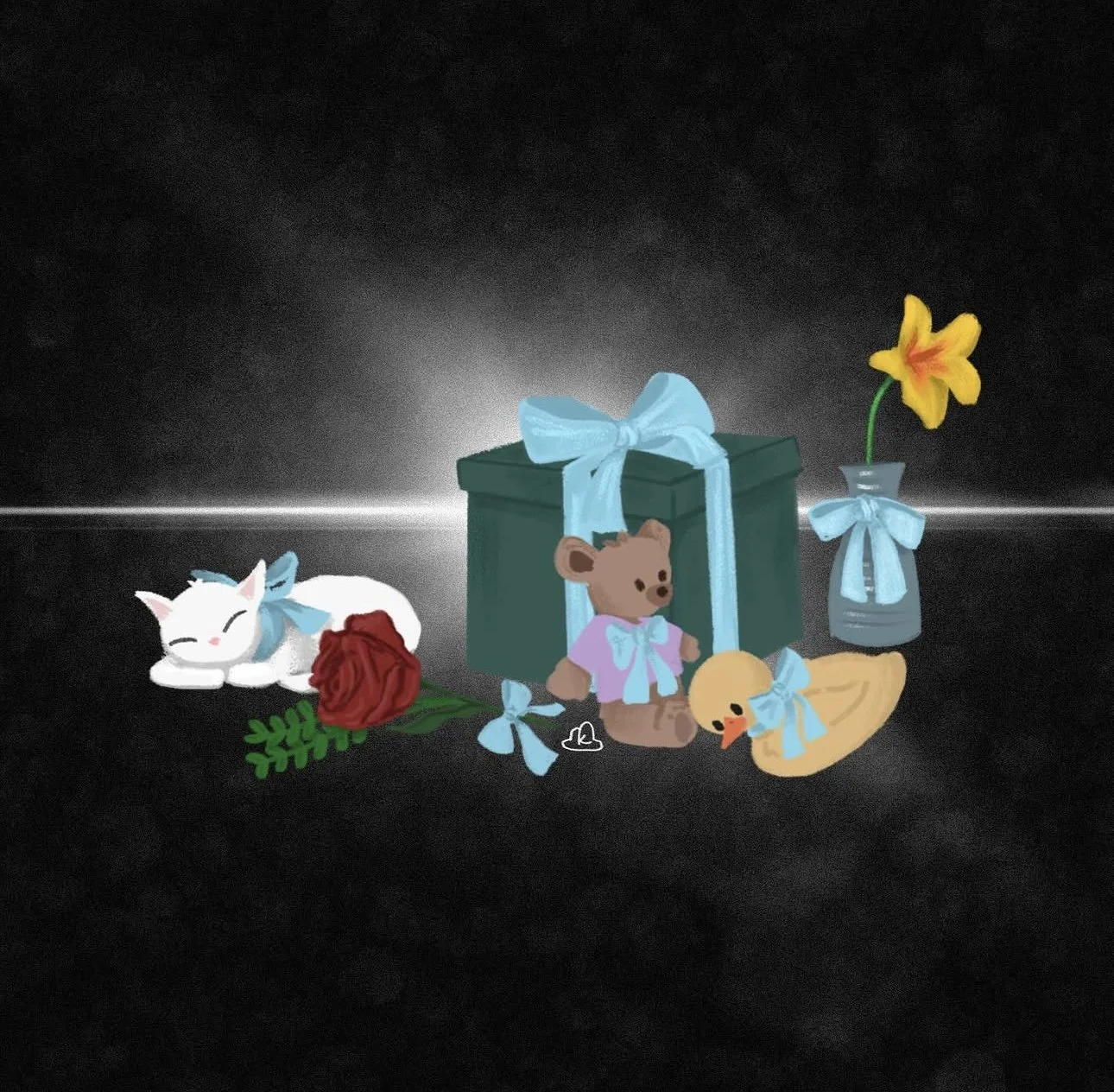
Hug - The Blue Ribbon
The blue ribbon plays a significant role - it symbolizes a hug. It not only holds the vase together but can also be used to gather all ten flowers into a single, beautiful bouquet. This gesture reflects a mutual embrace: one from me to my people(represented by the various items in the artwork, each symbolizing someone dear) and one from them to me.
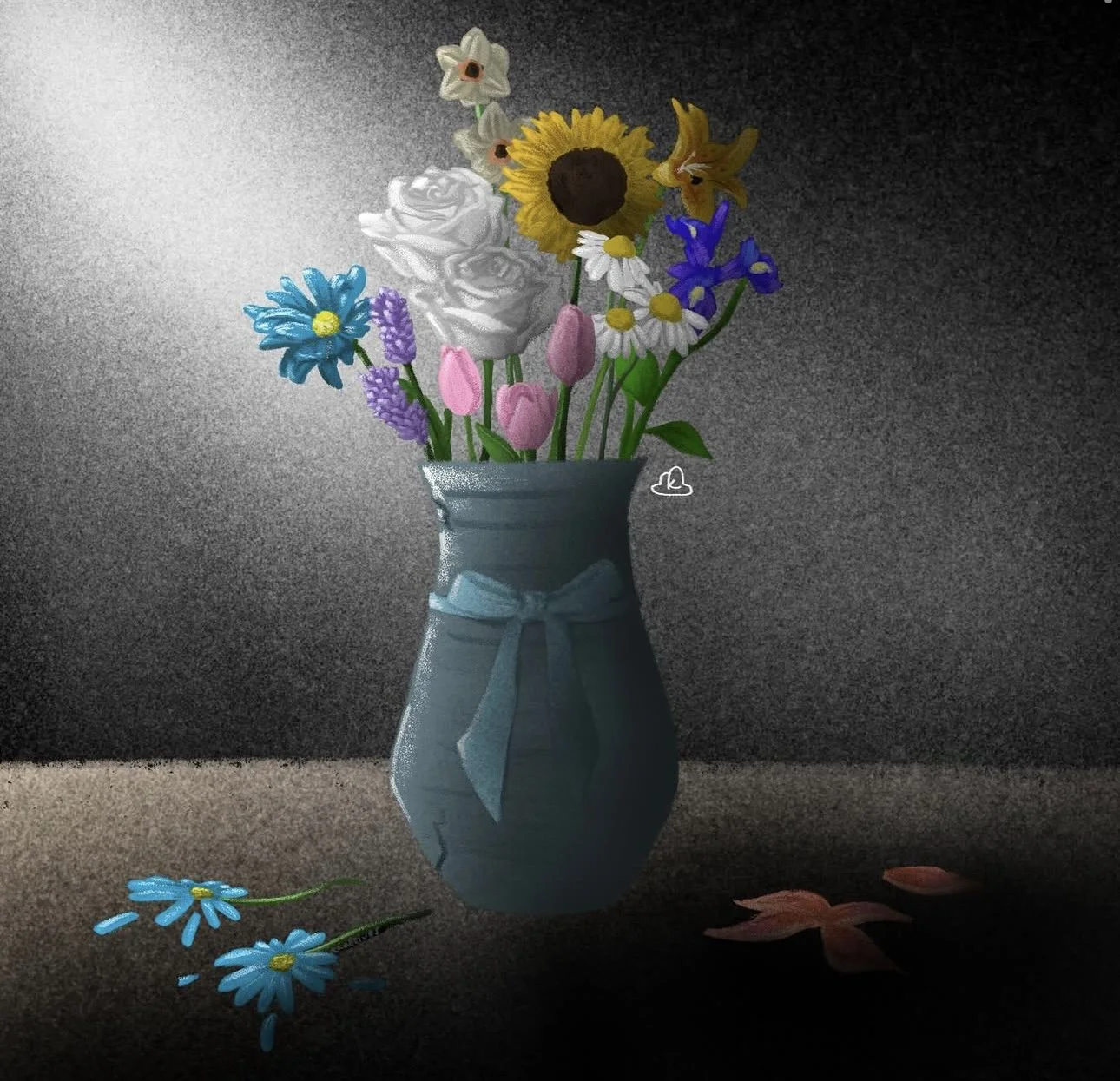
This second piece, titled Light, marks the closing of the chapter. The light in the artwork represents hope. As it shines on the flowers, it quietly suggests that “sometimes, all you need is a little light” to realize that beauty can exist even in what is broken. The vase, despite its cracks, holds the flowers - it holds love, healing, and quiet strength. The message is simple yet profound: “Fill your life with love, with people who remind you that you are more than your broken pieces.” It’s a tender ending to a journey - one of acceptance, love, and ultimately, the courage to let go.
Light
AWLA - ‘Ageless & Allure’
A second collaboration with Awla, where I designed prints inspired by the letter "A". The design concept was centered around the elegance and simplicity of this letter, which was then translated into the unique patterns for their collection.
‘Ageless’


The sharp, bold edges symbolises the empowerment and grace. It celebrates the essence of womanhood and for women of all ages to discover their timeless beauty and unyielding sophistication.
‘Allure’


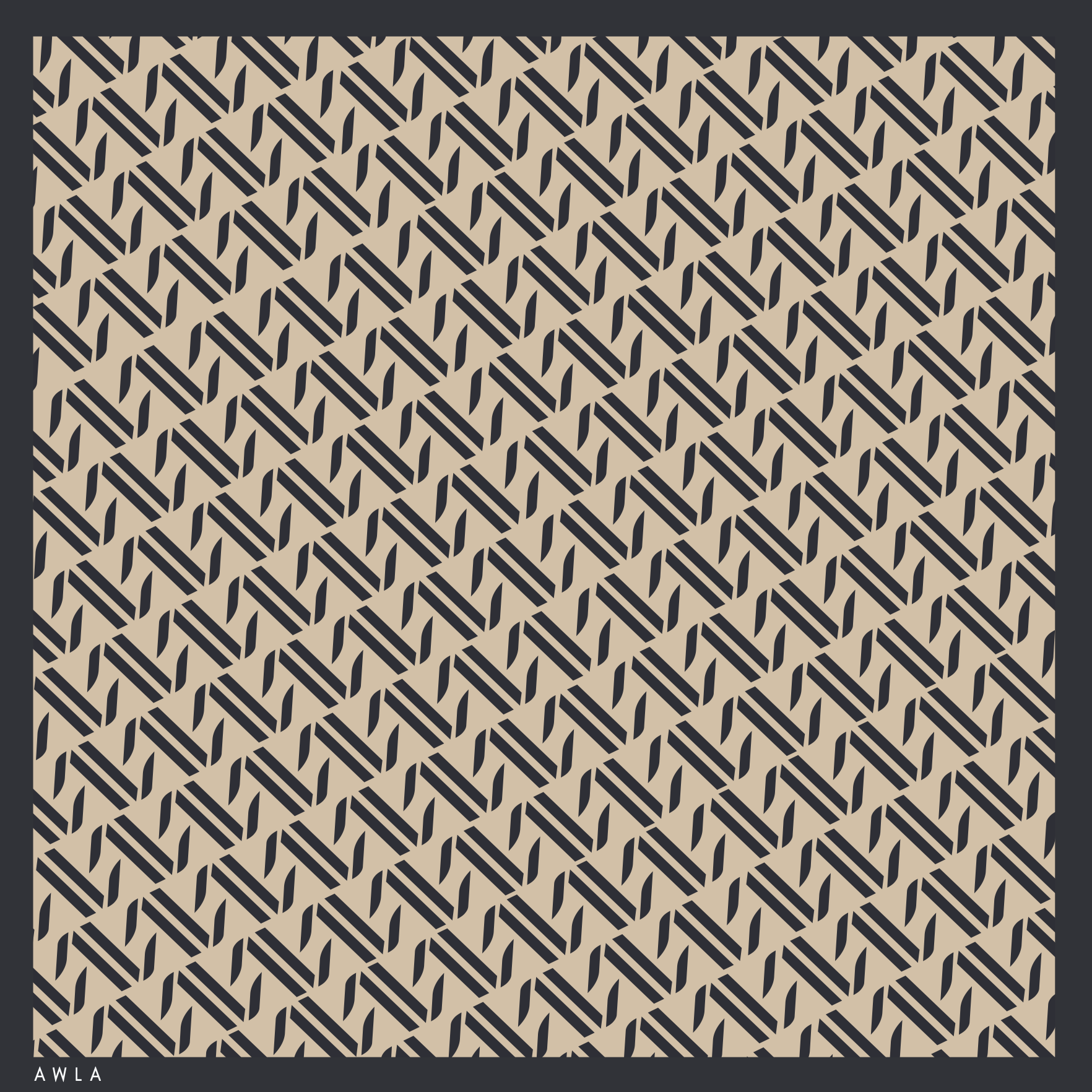
The letter ‘A’ have gentle edges, adding a soft and graceful touch to a woman’s outfit.
rama - rama
My original creation of Eid 2023 green packets

AWLA - Kesuma
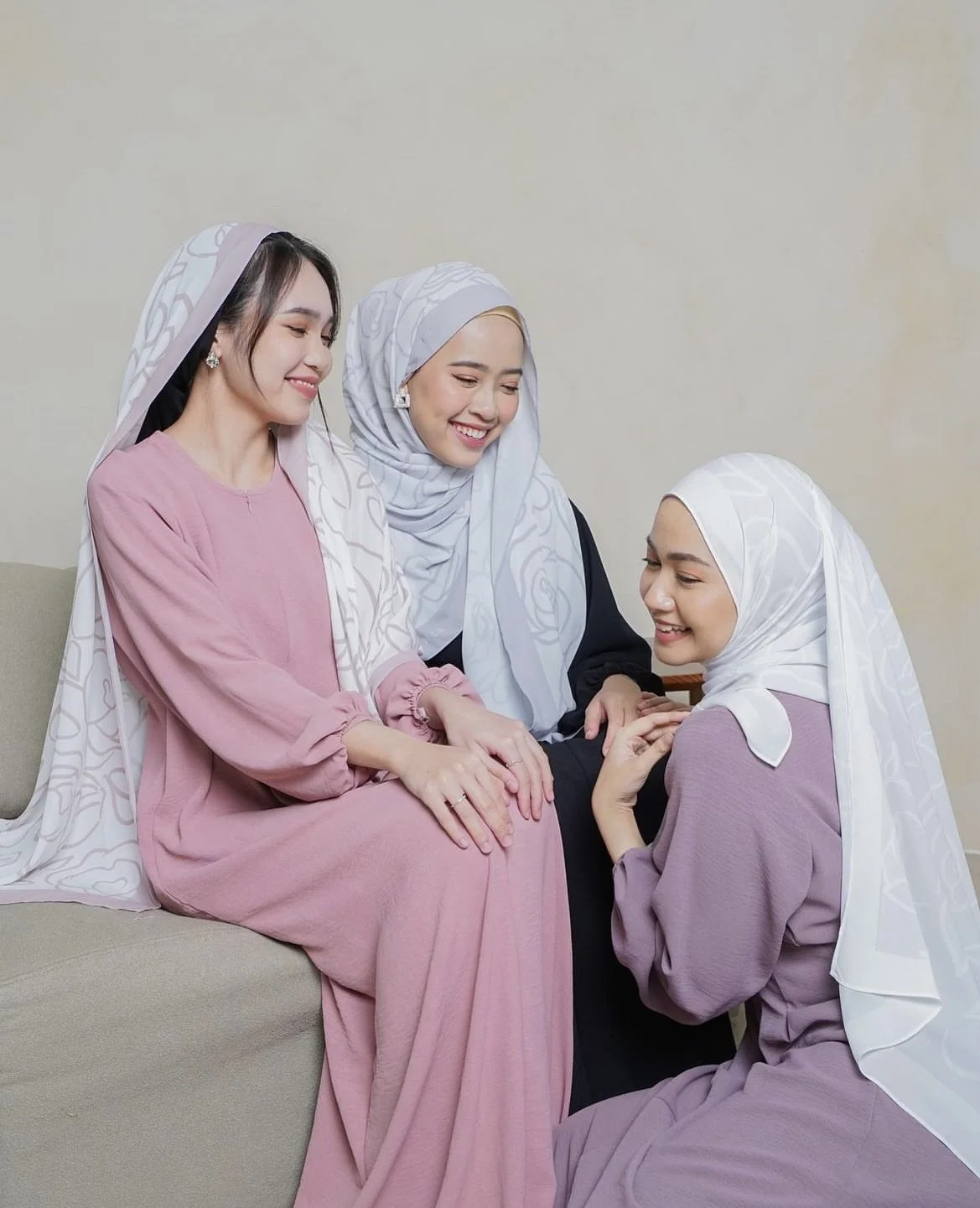

This was my first collaboration with a local brand, Awla. I had the opportunity to design hijabs for their Eid 2023 collection, blending my artistic vision with their unique brand aesthetic.


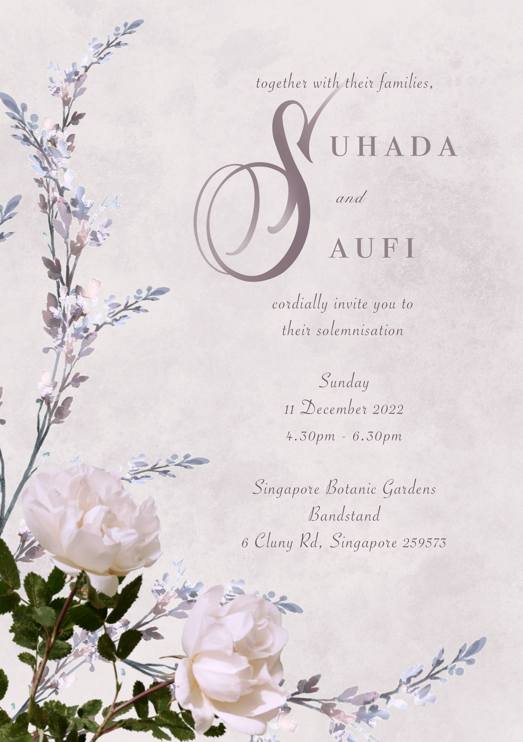
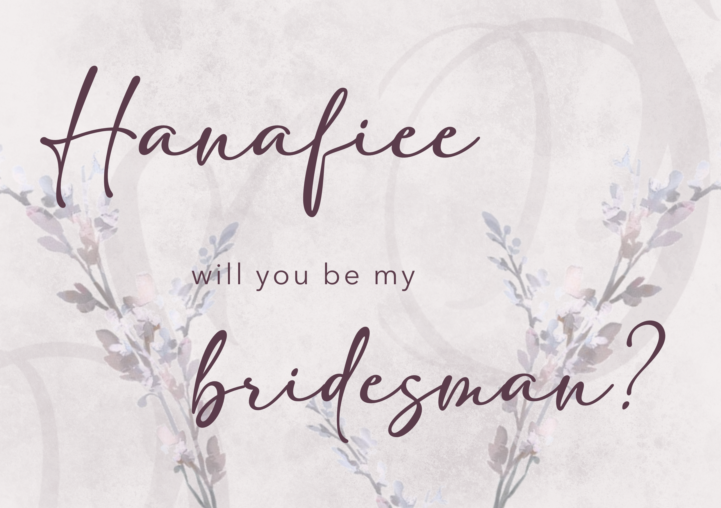
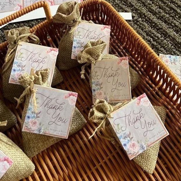
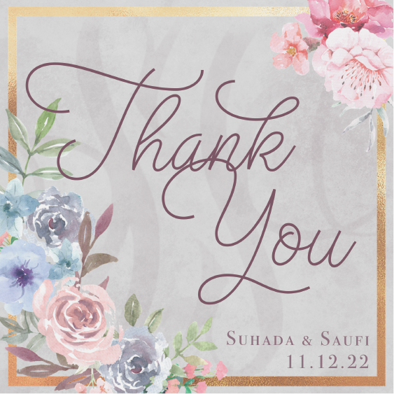
I was given the exciting opportunity to step outside my usual practice and design my friend's wedding invitation, along with other related wedding materials. It was a rewarding experience to bring her vision to life and create something truly personal and meaningful for such a special occasion.
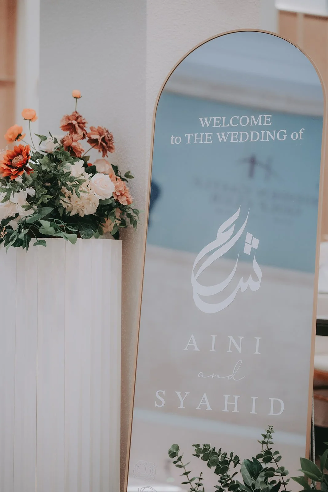
I also had the pleasure of designing a custom wedding mirror for another friend's special day.